Thank you devs for listening
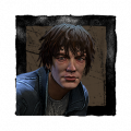
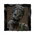
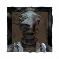
So everyone was upset on the Macmillan rework cause it lost its uniqueness with its blue tint now autohaven is getting reworked and it’s green it’s actually the green we need https://twitter.com/deadbybhvr/status/1325890982152450048?s=21 here’s the pictures for it


It has its green tint now thanks!
Comments
-
Gas heaven looks incredible
1 -
God that's awesome new but still keeping an aspect of the original. It even looks better for the Wraith.
3 -
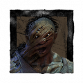
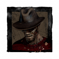
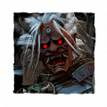
Blood Lodge impresses me the most, that shack looks straight out of a horror movie.
6 -
This looks awesome! The art and design team always delivers so well.
#makemacmillanblueagain
4 -
I agree. Hopefully, they tweak McMillan and they give it its palette back.
1 -
Man, the art team always kill it. Can't wait to see what the stacks of cars look like.
0 -
 17
17 -
Never thought about that as a meme format until now. Wish I'd thought of it.
0 -
Personally they broke mcmillan, and now autoheaven and ormond im so glad this is my last year in this game.
2 -
I was singing that song when I saw the pictures of autohaven wreckers I had that part in my head when I was writing this.
1 -
I know these are concepts but damn, it looks like it will be filled with deadzones.
Now we need them to edit mcmillian maps and make them blue again.
0 -
I'll bite...
Why? As in: Why is it definitely your last year? Why, SPECIFICALLY, do you have issues with these changes/how are those maps "broken"?
In a general sense your initial response (the one I quoted in case this isn't clear) is a big part of why some many see this community as toxic and entitled. Like any change one doesn't 100% support is treated like it is going to through everything in some massive, world shattering upheaval instead of a reasonable "Yeah, I don't like this but we'll see how it plays out".
2 -
It appears to be about the same slightly green as Macmillan's slightly blue i.e. almost negligible
However, I say almost because it may be technically more green than Macmillan is blue from a pixel perspective.
I'm still sad to these those breakable walls and to see that the fog still doesn't take on the Realm's color in any significant (or even minor) way.
Edit: it's looking a lot like a modified Swamp now, and I'm not sure I'm keen on that...but Blood lodge looks cool with that Swamp-vibe.
0 -
Let's hope they've tried to address the issues of dead zones on autohaven, and the giant singular map-wide loop that is Ormond. If they haven't then I'm really not gonna get excited for these maps coming to live. They're just gonna be the same as usual but with prettier graphics so you have something to look at whilst sitting on a gen, and also with breakable walls, something everyone loves.
Eh tbf though, Ormond can't get much worse, and autohaven maps are rather RNG dependent. Who knows hopefully they've got it right this time.
1 -
They look really good, and now I wonder if they'll ever give Macmillan it's blue tint back. I was fine with them getting rid of the tint before since I always thought it looked kinda bad. These photos have proven to me however, that they can keep the color tint and still make it look great.
I'm having a difficult time figuring out where that last photo is for some reason. Can anyone help me here?
0 -
I personally loved Mcmillan's new design and one of the reasons i hate Autohaven was because of the green, i'll probably still hate it.
Btw it's Azarov's resting place.
0 -
I love this! The art team did an amazing job!
0 -
The thick green air makes it almost look like it has a smog which given the theme of the maps is extremely fitting.
0 -
*Thank you art team.
We all know the balance devs don't listen to us, just statistics. 😏
1 -
I wish the maps would have a more unique grass/foliage to it. They all feel the same to me with that same light-greenish grass.
I definitely prefer the darker grass we have in the older maps. Despite every map having that same grass, the maps still felt more unique then they are starting to now
1 -
That grass though....hmm where I have I seen that before?....thinking thinking....oh yeah, EVERY GRAPHICALLY "UPDATED" MAP SO FAR.
Yamaoka, Japan, this grass
Macmillan, Murica, this grass
Ormond, Canada, THIS FFING GRASS...oh yeah with some snow.
Autohaven, I take it Africa, this grass.
come on art team pls, how can you even do this to yourself, who becomes an artist and then does not care about....their work, their art?
And its extra weird because a decent effort is put in the trees, which we barely look at during gameplay, but the grass we look at all the damn time.
If I was in charge I would have every realm have its own unique assets, unque rocks, ground, grass, trees, pallets etc
0 -
Does anybody have a photo of what that last image is in the current game? I can’t work out what it is. 🤔
These updates look awesome though. Can’t wait until every map has been reworked.
0 -
I didn't realize how badly I wanted to see that until right now....
0 -
It looks exceptional! I do hope they revisit the blue for MacMillan someday, but for now this (and the white of Ormand) makes up for it.
0 -
Natural light is better. Get rid of all these colors.
0 -
Okay but can we also all appreciate that the last picture is AZAROV'S ######### RESTING PLACE, like bro ######### that ######### looks so good
0 -
This looks amazing, Ill f*cking hate getting this map 80% of the time though still hahah. At least it will be a nice sight to my eyes as I get looped forever by rank 1s; it's all about the silver lining ;)
0 -
The art department doesn't get enough praise for all their work. They are amazing (as proven by the graphical rework) and have helped improve the game in a way nobody even thought would be done.
0 -
I think the maps look great. Personality I'm just confused why they screenshot these images instead of just downloading them lol.
0 -
They are trying to make all maps like yamaoka just to blend with the blue /green effect. Removing loops turning some tiles into complet dead zones, more useless breakable walls + new killer /surv perks and caracter appeal are preety garbage.2 chapters have pass and instead of some new maps they made reworks. This is a personal opinion.
0 -
AND WHEN I LOOK INTO YOUR FUTURE ITS THE GREEN THAT I SEE
1