Can someone explain what was wrong with some of the changes?

I saw the Devs are gonna do some more changes to the new stuff we got, but i don't understand why some of them are needed.
Hitboxes: I've seen myself that they are weird on the Survivor side, so i won't argue there
Character movement: I don't get whats wrong with the movement, they move way more realistic than they did before
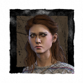
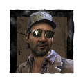
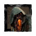
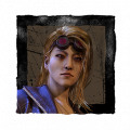
HUD: Another one i don't get. The names and hook timer could be bigger, but whats wrong with seeing the characters faces, i like them way more now that i can identify who is who, the white silhouetted figures were dull, the hook counts are good too.
Comments
-
This is from console perspective
Hit boxes as stated before are not connecting atm on the survivors acreen
The hook timer is pretty much invisible due to it being so minuscule on the top left. Making it harder for players to know how much time is left.
There is a brief pause when moving from the dying to injured state allowing the killer to easily close the gap on a slug play through.
360s have been removed with the new animation along with turns in general
And again hit boxes are atrocious but every player who isn’t a Dev knows hit boxes have never felt well FAIR
0 -
Are 360s even meant to be a thing?
0 -
The only thing I want is a customizable UI like DBD mobile has. I know they're different teams
0 -
Character movement feels clunky and awkward. Animations are stiff. Wounded running animation looks like you really gotta go to the bathroom. 360s are basically dead. No one asked for movement to look more realistic, the older running and wounded animations looked better.
The HUD is an absolute mess. Not the looks of anything but the placement of it. Before all you needed to do was look down to the left and you had all the info you needed - # of gens remaining, survivor health states, item and power charges. I play on a 32 inch monitor and I don't want to have to look everywhere on my screen to get info when it was all neatly in one place before.
But more importantly. No one asked for this. I have legit never seen anyone complain about the hud or how unrealistic survivors looked when they are moving. They spent time and money on this. The definition of wasted development time, especially when you consider how many other things are in dire need of attention.
6 -
I think it was about clearity. Items, survivors and gen count placements i get, but those white silhouettes didn't help much when trying to identify certain players, you only had to rely on the name back then
0 -
No need for insults, i'm just asking
1 -
That would be fine - make everything more clear. Add in new portraits instead of the white silhouettes but put everything back to where it was. And for the love of the entity revert movement back to how it was for survivors. The game honestly feels like its in early access now.
1 -
Simple: the new animations don’t look more realistic to me. They look generic as hell, and some of them are completely awkward (standing still, injured running), robotic, cheap and amateur.
Even if they did look more realistic, realism is not the reason I loved DbD until two days ago. Previous animations looked just right, a perfect mix of scare and goofiness, and they were actually one of the reasons I fell in love with DbD in the first place.
Edit; sorry I completely forgot to mention the HUD.
Many people seem to be suffering from motion sickness, eye pain, headache. Personally I think it is worse than before but not catastrophic. I do think that it looks amateur, bland, soulless, like some random free to play android game HUD, and I do prefer having all of the info in a single place of the screen, but I didn’t experience “issues” with it. I did avoid to watch it because everything was too scattered.
2 -
Alright, take a breath
0 -
Thats fair enough, i just hope they don't give us the white silhouette survivor icons, i like seeing who is who
0 -
TBH if you’re a good player you know who is who all the time even if you were to play without a hud. If you aren’t a good player then hud is the last of your problems lol
1 -
The white silhouette heads were just a bit plain
0 -
The issue I have with the UI is that it lacks compactness. Think about the original one, on the bottom left we had the status of all of the survivors and the amount of generators remaining. On the bottom right we had our perks and power status. Whenever we earned points, they would display on the middle right. (I think, I haven't played the game in AGES, my memory is fuzzy.)
This left the rest of the screen free for us to view the actual gameplay.
With the new UI you want an update on the game's status, well first look to the bottom left out of habit and see your item/power, then glance top right to see the survivor's status, then look down slightly to see how many hooks you've gotten, then look to the top middle to see how many generators are left. Your eyes have to go on a god damn book trilogy length journey to find out information that was originally available with a single glance. It's inefficient and that's what makes for a bad UI.
1 -
The hud is just bad with it's icon placement
im on console and the icons are so spread out i don't notice when they change.
when it was all in the corner just checking your power, gens left, or survivors gave you info on all three and now you have to do a full circle to check all of that stuff which is annoying and badly designed. This is relevant because on console with a big TV you could easily have some of your attention on that corner of the screen to notice when anything happened and that's no longer the case.
0 -
This has nothing to do with the new HUD. Portraits could have been added to the old HUD. If they couldn't do it with the system they had before they could have just reused the old design + portraits with their new system.
Many of us have exhaustively explained why it is objectively bad game design. It is a combination of spread out info, weird sizes, the fact that it looks like a mobile game's HUD/an MMO from 20 years ago, and the fact that you actually have less vision now due to it.
1 -
The hud is in the way of the scanning view. In games especially like these, you scan the environment for movement and colors. As someone whose been Rank 1 since the first few months the game released, I can not begin to explain to you how much of an annoyance this is. It makes genuine differences in chases. To counter this I set it to its smallest size, which doesnt help fully but helps a bit. The issue here is it also makes it difficult to see the icons but thats my problem.
There is also a HUGE issue looking at your information. Before it was like the gauges of your car. A quick glance, you know have all of your info. Your number of hatchets, who is downed, whose hooked, the gens. All of it in one glance. Now you really need to swap your attention. Okay that many hooks, that many gens, this and this, okay got it, now what am I doing?
1