http://dbd.game/killswitch
Are you satisfied with the HUD changes?


Comments
-
Yes (please state why in the comments)
Although I preferred 4.5.0s one, as I'm used to checking information at all parts of the screen from different games, I still think this is an improvement of what we had before 4.5.0. It's easier for me to track stuff as both killer and survivor personally, and I'm excited for where they take it as they said the main reason for changing it was to add new things.
1 -
No (please state why in the comments)
The problem with 4.5.0 was the player was looking a specific direction to get just one information. However, in the old HUD, you were getting 2-3 information in one direction which keeps players' attention to the game, not the HUD.
4.5.2 HUD's problem is, that, it loses the atmosphere. This is a pretty atmospheric game, and there is just... full of white color icons, yellow boxes, bigger and edgy fonts... It feels like I'm playing a Overwatch match.
5 -
No (please state why in the comments)
It's better than the 4.5.0 one, but that's not saying much. It's still pretty bad compared to the old hud.
4 -
Yes (please state why in the comments)
The info is back in one spot and unlike most people I'm not allergic to change.
Although I would like better character icons, the basic pics are a little... Unfantastic?
3 -
Yes (please state why in the comments)
Anyone else still looking up see see how many gens are left? Damn my feeble brain!
2 -
No (please state why in the comments)
Gen Count can be a bit bigger.
Power should be smaller (the only important thing is the number for Killers like Huntress or the Powerbar for Killers like Nurse, Spirit, no need to show me that big that I have Hatchets as Power).
I dont get why the symbols need to be in vertical order. There is no reason to do so. Biggest problem for me.
Character portraits dont look good.
5 -
No (please state why in the comments)
The Health State icon is currently the most annoying thing to me.
I can see who is healthy and who is injured, but can't guess who is on the hook and who is in the dying state.
Especially when i don't notice what is happening with certain effects or didn't pay attention to the players in the lobby.
When the gate is powered or when the hatch is open, we need to look down left to understand what is going on, because there is nothing that says "Find the exit and escape". it just an icon that letting you guess. not really helping for new survivors.
2 -
No (please state why in the comments)
It's better than before but I still think it needs some work... I don't know. I think the portaits doesn't really fit with the aesthetic of the game... I mean, you have the character portait but if you have the same survivor into dying state, it changes to the previous dying icon which personally I think they fits more in the aesthetic.
3 -
No (please state why in the comments)
Mainly for killers: The HUD (mainly on the left side) covers quite a large part of the screen, and could make it more difficult to notice hiding survivors. This HUD is basically giving you a lower FOV (field of view). So I think the HUD should move completely to the bottom of the screen, or move to the top, but leave the sides empty.
3 -
No (please state why in the comments)
It's an improvement over the previous iteration, but its still not ideal.
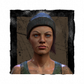
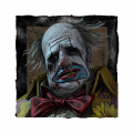
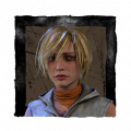
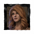
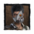
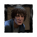
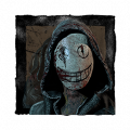
-Survivor portraits should use the adept icons instead of the model render images for aesthetic consistency.
-Number of times hooked should be visible for both sides, not just survivors.
-Survivor portraits should be aligned horizontally again, unless they have a very good reason for making it vertical; ie: if they plan to add a quick messaging system.
-Ability to adjust individiual UI element locations.
-A transparency slider.
4 -
Yes (please state why in the comments)
It's not distractingly bad like the 4.5 one. I don't notice the new one at all, which is an upgrade. If they're adding in new features like solo queue survivor basic messages, then it'll be worth it in the end imo
If they don't add anything really useful, then the old school HUD would be better in every way
1 -
No (please state why in the comments)
I still think this one is just far better, simple, and clean while still giving everyone the info they need. This should work for both sides.
 7
7 -
Yes (please state why in the comments)
Ultimately, I'm happy with the current HUD with one or two complaints. I actually preferred the previous 4.5.0 HUD. I liked it spread out like other online games.
-The gen count centered at the top of the screen was always in view (plus the extra text would help new players).
-The survivors being listed on the top left didn't bother me at all as I'm used to looking at party members' health bars in MMOs (typically listed in a similar fashion) and discord usernames. But ultimately it takes just as long for me to look at the bottom left as it does to look at the top left so it's no big deal either way. If anything, I think that it looks too bunched up now. Yes, I guess you can see more information at once, but typically I'm not looking for all of the information at once. I'm glancing to see how many gens are left or a player's health state, etc.
-The survivor portraits that are being used don't bother me. They could use any and I would be fine with it. I don't pay that much attention to those details in game anyway. I would be fine with just names. *shrug*
-My biggest issue with the HUD is the Killer hook count. As is, I'll never use it for information. When it came out, I thought it was going to reflect "how many times you've hooked survivors", not "how many "hook states" have passed." It's supposed to help keep track of progress but you can't get an iridescent devout emblem if you don't hook survivors at least 9 times. I don't care if "three hook states" have been counted because someone died. I know they died. Their picture tells me they died if I need a reference and those two extra hook states that have been counted because they happened to die on their first hook don't mean anything to me because that survivor is dead. What I *do* need to know is "do I need to hook this downed survivor to get my iridescent emblem or have I hooked enough survivors this game and can use Devour Hope to kill them?"
1 -
No (please state why in the comments)
That´s exactly what I hoped for it to turn out but that unfortunately did not happen. I love how simple it looks and still gives even more info than before. Maybe they'll change it so it looks kinda similar to this. At least I really hope they do
3 -
Yes (please state why in the comments)
They addressed all the issues with it so yeah and I like the new features. Don't care either way for the aesthetic change
1 -
Yes (please state why in the comments)
YES! Because now there's so much advantages (more information) for either the Survivors AND the Killer!over the traditional Hud.
Survivor Advantages:
1 - Survivors can SEE the character (faces) each player is playing (who is this "Claudette" is something from the *past. Just look at the HUD! (*Unless there are multiple Claudettes!)
2 - We can see WHO has been hooked and how many times! No more guessing if a random player has been hooked once or twice!
3 - We can see how much time a hooked survivor has left before the Surivor gets sacrificed!
Killer adavntages
1 - Now the killer can see how well (or bad!!) he's doing by seeing in the HUD how many times he has (or not!!!) hooked the Survivors!
2 - The Killer can SEE the character (faces) each player is playing (who is this "David King" is something from the *past. Just look at the HUD! (*Unless there are multiple David Kings!)
3 - Killer can see how much time a hooked survivor has left before the Surivor gets sacrificed!
4 - The Killer can now see WHO has been hooked and how many times! No more guessing if a random player has been hooked once or twice!
I think the New Hud would work if it was still placed at the previous location, down at the left!
But I'm getting used to the new placement...
EDIT: Forgot to add, I don NOT like the new location of the Spectator HUD/Control buttons. (all the way up!!) It was PERFECT in previous updates! 😪 Now, I have to always move my mouse (PC gamer) all the way up accross my screen to reach the Spectator controls...
1 -
Yes (please state why in the comments)
Yes the new HUD changes are solid, love where the vertical list is placed, just overall looks clean. However, I'm hoping the they'll address the status effect timers soon.
1 -
Yes (please state why in the comments)
For the most part, yes. I will say that killers should get hook info on survivors. It wouldn't clutter the hud, it isn't an advantage to the killer really, and the knowledge doesn't make a killer tunnel more. As is keeping track feels kind of an unnecessary annoyance especially since it already keeps track somewhat.
Other than the hooks thing, it looks great! (Maybe add totem info but I feel less strongly about that)
1 -
No (please state why in the comments)
It's 100% better than 4.5.0 version but I still would like to see the HUD at the bottom again. It's extremely off putting to see a massive blank space there when you haven't brought any items.
Also I'd like the points moved lower. I always like to look at the points but right now I forget they're up there. It's especially annoying when you get a hex prompt and you don't get to look up there fast enough.
2 -
No (please state why in the comments)
I feel the screen is more cluttered than before
1 -
No (please state why in the comments)
The HUD changes are a slight improvement and a step in the right direction. The only complaint I have is that everything seems very cluttered, due to the survivor portraits being placed vertically instead of horizontally.
1 -
No (please state why in the comments)
Cant understand why they changed HUD which existed from the start of dbd, cant understand what the devs are thinking..
1 -
No (please state why in the comments)
The vertical HUD is not something I enjoy, it covers important parts of the screen where I'm trying to look at the gameplay. I never had any problems with the previous HUD blocking the game but this one has already screwed me up several times.
2 -
Yes (please state why in the comments)
Overall, yes. I think things look good. I don't see much point to the hook at all for the Killer, however, since it doesn't eve accurately track how many hooks you have gotten. Whenever anyone dies it counts their hook states in that graphic even though they don't count for us. I think it would be better to just have a straightforward counter or take them away entirely. It provides ZERO usefulness.
1 -
No (please state why in the comments)
No. The survivor stats should return to being horizontal along the bottom of the screen. The information has the best readability in that form.
I would also prefer the character art from the adept achievements to the current character portraits—it would fit the aesthetic much better—but that's just a personal preference and doesn't affect the usefulness of the HUD, unlike the survivor stats layout.
2 -
No (please state why in the comments)
Its ok... I'd like the character heads to not be coloured and there is plenty space in the bottom left to lay them horizontally.
1 -
No (please state why in the comments)
id prefer it if it was horizontal and not vertical. it doesn't line up visually unless you are running an item and I usually don't care enough to run one. also I don't like the color portraits its hard for me (colorblind) to read. i liked the colored status effect with the white image we had prior to this.
1