http://dbd.game/killswitch
Opinions on the logo change?

Simple logo's have been a trend for a while now but most companies in recent memory that have tried a rebrand have been heavily criticized for unnecessary change that removes personality and recognizability. This makes you wonder why so many still try. But here we are, the trend of oversimplification has reached the DbD logo and I'm wondering how people feel about it.
I'm personally not a fan, DbD has a very gritty aesthetic that the detailed logo catered to, this new logo reminds me of the new HUD and feels like an attempt to become modern for the sake of being trendy. The text feels like a mishmash of different horror movie fonts and lacks any originality, while the new tally design lacks detail and personality making the logo as a whole feel much more generic.
Curious if anyone else shares the same opinion.
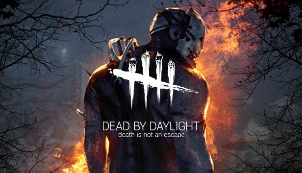
Edit: For those who haven't seen it yet here are the highest quality images I could find of the new logo so far.


Comments
-
I'm not a fan of the logo change. The old logo was very distinct, fit the game, and overall looked good. The new logo looks like no effort was put into it and just simply looks bad.
5 -
It's boring. It's generic. It lacks a strong identity of its own.
7 -
Since when did the logo change?
4 -
It looks bad. VERY BAD.
0 -
new font sucks & the faces on the tally made it DbD's logo
1 -
The day of the anniversary stream, so the 25th.
0 -
Bring back the tagline
It's part of the game's identity
6 -
ew looks generic and corporate
0 -
Can you link a pic? Haven't seen it.
0 -
New logo bad, old logo good
1 -
Since it's very new it's difficult to find large high quality images of it, this was the best I could find.

 0
0 -
Holy ######### that's really bad.
2 -
I'm not super fussed either way but if I had to choose, then I prefer the old one much more.
1 -
ARE YOU ######### KIDDING ME???????
They made it look 10x worse for no reason
4 -
Even dbd logo has been oversimplified
2 -
I think it might be a chapter-specific thing. It kind of fits the RE aesthetic.
1 -
Nooo where are the skulls :(
1 -
I thought that at first too and I really hope so. They're changing all of their marketing and banners for the game to this including the steam store page which has never been done before, which leads me to believe it's a complete rebrand.
1 -

I never thought I'd see the day where dead by roblox looks better
5 -
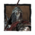
This was the original, correct? If so, yeah, it's far better. But I agree that the new logo is probably just for RE, just as the All-Kill chapter was plastered everywhere (for the worse).
 3
3 -
They got rid of the skulls???
3 -
Yes, that's the original logo, chances are it might be a stylized thing for RE but they've changed the steam store page which has never been done in conjunction with a chapter before, which leads me to believe this is a full rebrand. Here's hoping that I'm wrong though.
3 -
Yeah I mean change isn't necessarily bad but in this particular case I agree with those who say that the new logo is more generic and loses some of the game's character.
0 -
I actually just noticed that the forum's logos changed. I hope to god that DBD isn't getting the Discord treatment. I don't know who started this trend of minimalism (RIP Doritos and Warner Bros) but somebody needs to have a long, hard, unpleasant talk with them.
1 -
i liked the old one better the new one look so plan and uninspired
2 -
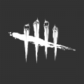
I really liked the skulls. It conveyed the four survivors with the killer represented as the slash across them all. THis is just .. hashmarks I'd put on the cell wall to count the days until I get out of solitary...
The identity has disappeared.
1 -
I don't mind it tbh.
0 -
It's alright, they're following in the footsteps of every maturing company, like the Microsoft logo, or the Google Chrome logo, & Firefox.
0 -
In my opinion, that doesn't exactly mean DBD must do the same and ruin a logo which was good in the first place.
If you played Tetris, you know how this goes: the moment you fit in, is the moment you disappear.
0 -
Old one is far better. Not even close
1 -
The skull logo is really clever -- I hope this change isn't permanent.
1 -
No idea why they removed the skulls! It doesn't look inspired. Only the background colouring is good. Otherwise, it's not a good change, and appears rather bland and uninteresting.
It's not a major thing for me, but they have taken something that was distinctive and removed everything that made it representative. It'll be nice if they revert it.
1 -
Looks alright to me.
0 -
I believe that it's quite unattractive as the font reminds me of a font that a Youtube channel would use, and the dashes don't have the distinctive skulls and details that the old one had.
Hopefully they revert it back as this logo is just plain bland.
1 -
Completely agree, the meaning behind the logo was unique and what gave it identity, the text is one thing but removing the single element that distinguishes your logo from the rest isn't smart. Hopefully we can get word on whether this is temporary or not.
1 -
Removing the skulls from the logo is so disappointing. Now it just looks boring and has 0 character to go with the game. What they did to "Dead by Daylight" just looks like they decided to go with extra bold font and I don't care about that. The removal of the skulls though is just bad and makes me question who they have hired in that department that not only would take a cool looking logo and just make it so dull but who would also approve such a poor decision.
1 -
I don't like it at all. The bad thing about this new logo is that it doesn't mean anything.
Pretend you never heard of dbd before and you look at this logo, what does it mean? It's just a plain tally mark of 5. There's nothing to tell you what the game is about. It could mean Overwatch's new 5 player teams for all we know as there's nothing to indicate horror or asymmetrical gameplay. It is just bland and meaningless. I suppose that one upside is that it is easier to draw, but the old one isn't that difficult anyways.
Now we look at the old logo, which immediately tells you that it's all about horror, due to the skulls and overall grittiness. The tally mark also cleverly clues you in to the number of players (5 players) as well as its asymmetrical nature (4 skulls being crossed out by 1 line representing the killer). Without even the title the logo tells you what type of game you are expecting, something that the new one lacks.
I hope they go back to the old one as the new logo has no identity of its own and has to be carried by the title. If you show the new logo to someone unfamiliar with dbd they'll just see a tally mark, while the old logo has enough uniqueness to make people take notice.
1