http://dbd.game/killswitch
About new the color rarities
Why haven't you reverted these changes despite tons of negative feedback?
Comments
-
Yet another UI change no one wanted that just complicates things. BHVR’s speciality lately.
19 -
The only negative feedback they care about is when it affects Killer Role.
-33 -
the moment I logged into the game and selected Orela, I hovered over one of her uncommon perks (which was GREEN) and got a voice line saying "this doesn't feel right".
Bhvr, even Orela agrees.
20 -
I hope they revert it soon
4 -
Perk colors too? I thought it was just offerings
1 -
Items aswell
0 -
EVERYTHING that was green is now blue
everything that was yellow, is now green
yeah, idk why either
10 -
From what I've seen, some cosmetics have changed rarity either
1 -
Its not that big of a deal. They look nicer anyway, and clear up confusion for new players who are familiar with this rarity colour scheme in other games
-14 -
It clears up confusion until they go looking at basically any community guide, entertainment video, stream VOD, or any other content made about the game prior to this update, at which point it'll add confusion.
This game's rarity grade also wasn't actually hard to grasp, it's just a matter of looking at your inventory and going "huh, those are weird colours to use".
So, no real confusion is being removed, and some real confusion is being added, plus the colourblind accessibility concerns. I'm sympathetic to the goal and I even like the colour they picked, but this was just flat out a bad move to make.
18 -
Again, all they need to do to solve colorblind issues is introduce a symbol to distinguish each rarity. Looking at videos prior to the update won't add any confusion either, since the actual icons of the offerings, perks, items, add ons haven't actually changed other than the rarity's colour entirely
-2 -
Oh, I didn't realise we'd conversed about this before, my bad. I have a bad habit of not looking at usernames before I respond, haha.
Well, like I said before, it's also fixed by just not making arbitrary changes. The names and icons haven't changed, but those aren't the things people have used to convey which item or addon they're talking about for eight years - people don't usually say "Emergency Med-Kit", they say "green medkit", which now means the wrong thing.
This wasn't necessary, and it achieves nothing while adding new problems. It should, flat out, just be reverted.
That said, I do like the blue colour. I saw someone suggest using it only for map offerings to distinguish them at a glance in the bloodweb, and I do like that, that'd be a good use for it.
4 -
For something like that, they could just have symbols in the corner of each offering type's icon. DBDM had a sorting machanic that would quickly narrow down offerings, perks, add ons by what they do to affect the trial or your inventory. Core should have this too, and then have the symbols as well to immediately know which sorted category an offering/perk/item/add on can be found in
-6 -
Or just go back to the old system that worked perfectly fine.
I can respect wanting to salvage the work that was done, but in this instance, there's no need to actually change the rarity system. It worked perfectly fine before, what's the benefit of changing it?
10 -
This content has been removed.
-
The colors confuse me honestly. They feel counter intuitive. I hope they revert it.
12 -
The newer generator sounds didn't cause actual, practical issues, though. That and the new survivor animations were just a case of people disliking something on subjective grounds and reflexively being averse to change— resulting in one of those things being changed.
The new rarity system has actual issues, making the game more confusing for new and veteran players as well as harming colourblind players' ability to tell rarities apart at a glance. Those are things worth criticising over and reasons why this system should just flat out be reverted.
I'm not against a toggle for people who'd prefer a more traditional rarity grade, but the default system should remain what it's been for eight years.
8 -
This content has been removed.
-
Just give us an option to turn it off. If people want to keep it that is perfectly fine. However, I prefer the way it already was. I would love an option just to turn it off so it goes back to default.
5 -
I don’t understand the reason for aligning rarity colors with other games.
Isn’t it more common for each game to have its own rarity color scheme?
It's said to be a UX standard, but as someone who often plays Japanese games, the new rarity colors feel out of place to me. In many Japanese games, the typical order is white < bronze < silver < gold < rainbow, and so on.
Maybe they wanted to use yellow (a gold-like color) for event items, but I personally preferred the original color scheme.
I don’t think it’s a de facto standard worth abandoning a game’s uniqueness for.
And if the goal is to improve UX for colorblind players, placing blue and purple next to each other might not be the most helpful choice.7 -
I think it's fine, it just takes some getting used to. MY concern is that colorblind players won't be able to distinguish all those blues and purples necessarily.
0 -
maybe someones gonna make an icon pack where it changes colors to the old version
0 -
Such things are banable as far I know
1 -
This is what we get—>
This is what we had —>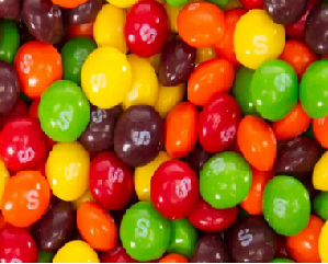
Wild berry does taste better thats for sure4 -
Probably never.
We never got the Next and Previous buttons from CSS (Character Select Screen) back, so I think they'll never revert this as well.Fortnite seems to use this color system for the rarity of things.
1 -
Well this is not fortnite, this is dead by daylight. It's not right that they kick the originality of the game like this
7 -
Have to agree with you, but since statistically a bunch of people who grew up playing Fortnite also did it with FNAF and BHVR want to the most of players to stay in DbD after playing FNAF DLC…
-3 -
Mandatory gif post
 7
7 -
On the one hand it's different, which makes it feel a little weird.
On the other hand, I actually like the colors better. More blue in my gui is always welcome, lol.
Honestly I don't care one way or the other, and it hasn't affected my experience in any meaningful way.
-9 -
I don't like the change at all. Why change something that people grew accustomed to 9 years in?!?!
I don't care about name changes, but the colour's are engrained into how we play dbd.
"Pig has a purple addon that is... You can combine the purple one with a yellow or green one." - not anymore.
This has to be the pinnacle of unnecessary changes that has happened over the last couple of years. Please revert as soon as possible.
6 -
My current emotions: -
- I like the blue colour... it looks cool. Blue Map 🤘
- I miss yellow... it was a nice contrast to purple...
- Rewiring my brain to see green items as yellow items hurts my head...
3 -
For Counter-Strike, they went this route:
Common (consumer-grade) - Gray/silver
Uncommon (industrial-grade) - Light blue
Rare (Mil-spec grade) - Blue
Rare + (Restricted grade) - Purple
Very Rare (Classified grade) - Pink
Ultra Rare (Covert grade) - Red
Contraband (banned designs) - GoldDefinitely a unique color grading system, and I don't see why DBD could not keep its unique colors.
2 -
Custom icons are not bannable as far as I know.
-1 -
Thanks for adding the completely unnecessary “us vs them” comment
3 -
I doubt they will change it even with the overwhelmingly negative feedbacks. It’s not enough of a pain to stop people from playing the game, which is really the only thing that BHVR reacts to when it comes to backtracking on unpopular changes. As long as the player count holds steady, they see no reason to change direction.
-2 -
I feel this colour change was made while Gene Wilder was doing his "common clay of the new west" bit from Blazing Saddles.
0 -
You really don't have any sense regarding color.
Like this rarity change, there is a lot of confusion during play because they have made everything the same color, such as the footprint/generator and survivor's aura on the killer side, and the mine blasting, etc. and trail color on the survivor side.This is another area where changing the color of each object could improve the playing experience, but we have kept it the same.
0 -
I agree with you thats why they did it, screw the core base who have supported the game for years.
Problem they'll have though (like they always do)
Fnaf brings new players, new players get tunnelled out lighting fast, or stomp killers in swf, or just realise the game isn't remotely in anyway fnaf & the majority leave.
Some stay & grind, they realise how bad the grind is (including the new season pass) & then the majority leave.
So then we have a few thousand new players & the core base (not all of whom will hate the changes but some will quit because they're sick of not being listened to, because of fnaf in general, because of the grind or even accessibility, my son is coulour blind he won't ever touch this game again now even if they revert it)
& they won't revert it just like they won't comment on it, same as they always do with UI changes they show them off, get hate, ignore everyone & do it regardless no discussion to be had.
Their company & their game, live & die by their choices & this game still isn't about to die, but fnaf is not the golden egg some people seem to think, yes new players are needed, but lose enough of the core with all the other issues this game has no new chapter will ever save it.
5 -
I have to presume they did some market research that said possible new players liked the new colors better and, given an expected flood with FNaF, they decided that was worth more than the existing players.
Understandable I guess, but I personally really dislike them.
0 -
You know, the more I think about this topic the more I realize that what bothers me the most (aside from the obvious accessibility issues, the fact that no one asked for this change and the fact that they decided to introduce a change no one asked for when there are more pressing matters that need addressing and that people have been pointing out for years now) is the fact that the new scheme keeps the color green but for a different rarity tier. Because if they had changed the green and yellow items/add-ons/offerings/perks to be two completely new colors, sure. It would still suck but eh. But the fact that formerly yellow stuff is now green makes it all so unnecessarily confusing for the older players of the game. I think if you're going to introduce a change like this, you should overhaul the whole thing at once and avoid assigning the former colors to different rarities.
TL;DR the changes would suck anyway but they could at least have avoided a lot of confusion if they hadn't made formerly yellow stuff green.
3