Can we get an athmosphere update for the coldwind realm like we got for the borgo realm?

It should be darker. It is way too bright. The old version looked so good!
Comments
-
 10
10 -
That was my introduction to dbd. I miss it a lot.
I don't want all the day Corn to go tho, I really enjoy the vibes of Thompson House for my "first match of the day" experience. But I definitely want all the others back!
3 -
I'm probably in the minority here, but I hate what they did to Borgo. I genuinely think it looked so much better with the red hue.
1 -
I don't think the red Borgo looked terrible I just think the problem was that it was impossible to see auras there, and for that I am grateful for the update. I feel like Coldwind could also use a similar update, but it is also not nearly as big of a problem as Borgo was.
4 -
maybe they could do what other games do, where they cycle times of day to make maps feel a bit fresher.
3 -
I liked old borgo as well, but after they reworked shattered square looking over the whole map wasn‘t a good thing anymore and I like the new aesthetics more.
1 -
Agreed, way too bright. Original Coldwind looked so much better.
4 -
That could be done as well, but I don‘t think behavior will put that much effort into maps.
0 -
I don't necessarily want it to go back to the old lighting with the yellow filter, but I'd adore a similar kind of lighting like in Family House or Abandoned Mill in the TCM game.
1 -
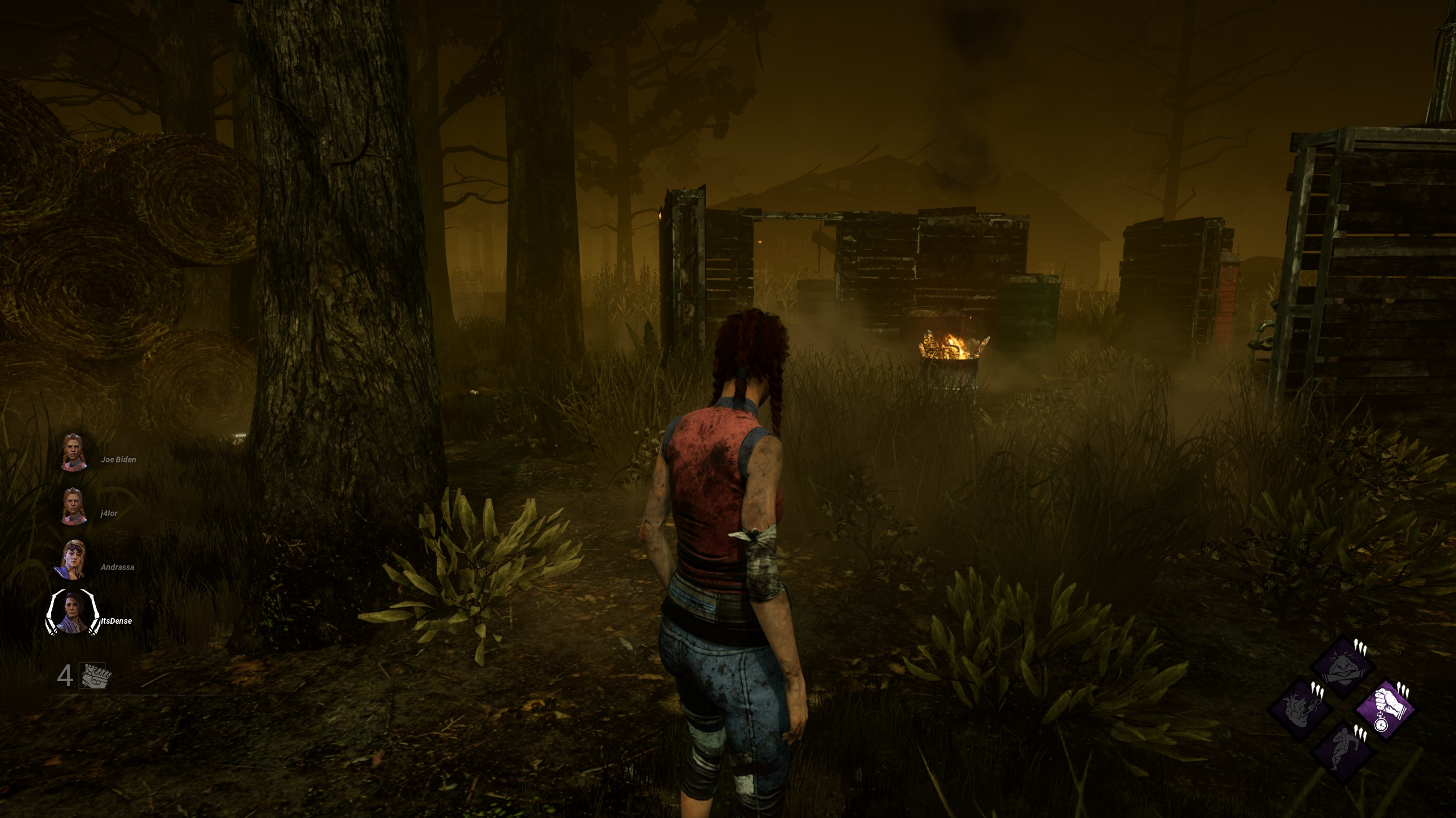
imo the problem isnt that it’s too bright or that it’s day-time but it’s lighting, (missing) fog, Rendering distance and depth of field, which affects all maps. Even if they changed it back to nighttime the atmosphere wouldnt be the same as early day DbD
I do miss old dark Coldwind and wouldnt mind both day and night version to be available at the same time but the Main Problem is that you can basically see the whole map if it wasnt for direct Line of Sight blockers
2 -
Can you send in a picture, so everyone knows what you mean?
0 -
I agree with what you said. Being able to see the whole map and its borders isn’t good.
I wished they would generally do a athmosphere update.
1 -
the borders are making it so much worse yeah. Like.. just flat ground that ends after a few meters? 🙄 very immersive
1 -
I hope they make less flat maps like the swamp maps or they go further and make them even more realistic.
0 -
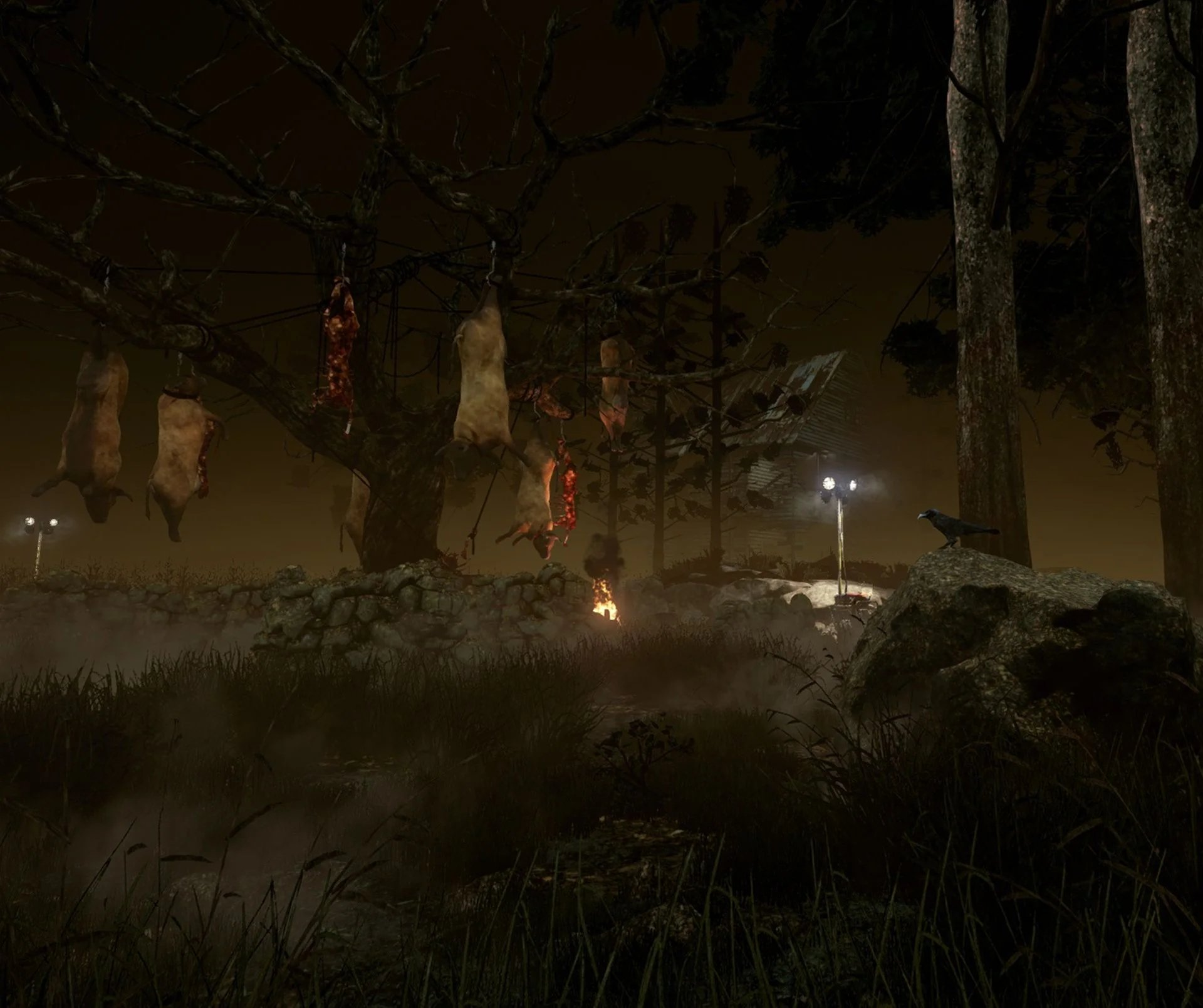
I sorely miss old Coldwind, I don't know why they made this realm in the middle of the bright sunlight so it feels like mid summer.
Coldwind was my favourite realm on either side, just because of the vibe.
I have such fond memories of early DBD, SWFing with friends until dawn in the overwhelming humidity of summer, while the dark golden skies of Coldwind set the mood. Then as dawn came I would head to bed and watch No0b3, Monto or Puppers etc to send me off to sleep.
They ruined Coldwind, it broke my heart
 Post edited by MaTtRoSiTy on8
 -
I agree that New Borgo was better than Old Borgo and I think the game spaces in general could be more dark, but also Coldwind needs to become night, its so bright and it fits Texas chainsaw better than Dead by Daylight.
2 -
I kind of agree. And while they are at it, they finally need to increase the minimum number of pallets that spawn on those maps.
2 -
Yeah coldwind maps are so bad for survivors. I still wait for the old rancid abattoir main building to return, then that map would be halfway playable at least.
2 -
Agree, having darker maps would be better.
2 -
I wouldn't say they are that terrible. But they could be more balanced for sure with some more pallets. Cowshed is quite fine if you ask me, at least most of the times, Rancid Arbattoir is the worst of the Coldwin maps for survivor.
1 -
I just found out yesterday again, that the devs decided to not spawn windows in the jungle gyms where normally one should have been. Instead of windows there were gaps at the window location on tourment creek. I really hate this design philosophy.
1 -
I can't stand the colour palette that was chosen for this realm. Darkness is the only solution.
0 -
Yeah I find the white coldwind so damn ugly
0 -
I think Borgo was one of the ugliest Maps in the game with the red color. I dont think it is pretty right now, but it is better. At least gameplay-wise removing the red was mandatory, having things like Auras or Scratchmarks in red and a general reddish color to a map is a big No.
Yep. They replaced the strong Tiles with kinda weak tiles, but did not add any Pallets to compensate for it. It is fine if they dont want the Maps to be full of Jungle Gyms or Longwalls, but replacing them with weak Tiles and then not doing anything more is wrong.
@Topic:
100% agreed. The daytime looks bad on Coldwind. I liked the dark and dirty look it had before.
1 -
Sure thing!
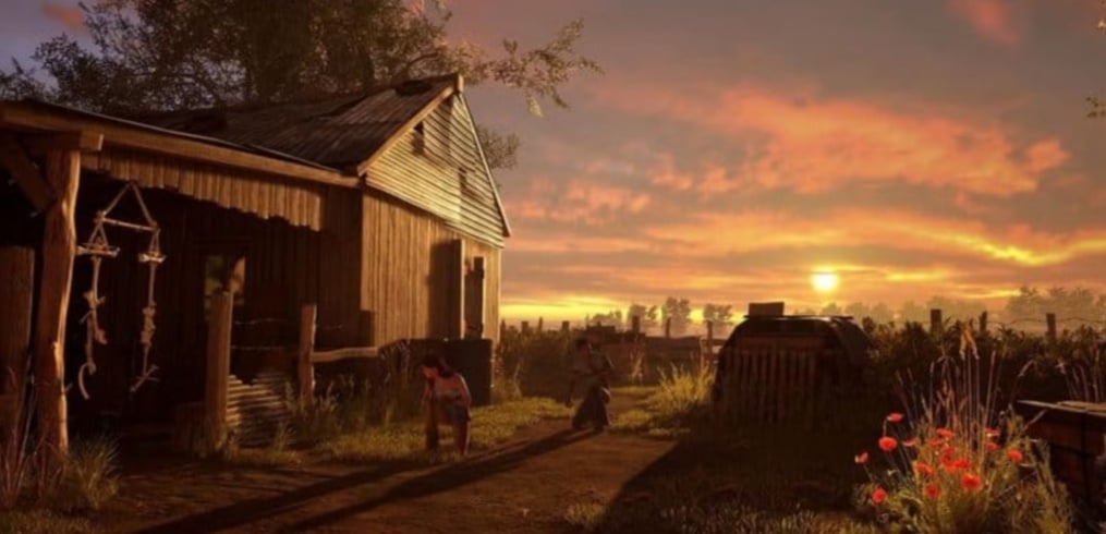
Add in a bit more fog, and you are set.
I really think this would look great.
1 -
If coldwind looked like that it would be cool too.
0 -
it was a disaster of a map. Trying to see auras and scratch marks was the biggest pain imaginable
0 -
I agree completely, friend!
1 -
I want it to be set at night again, not in the day with brilliant sunlight. Daylight kills the horror vibe imo
1 -
Honestly, same, my friend. And I would like to have the Fog back, actual Fog from the early days.
3 -
Agree, so much of the dark and gloomy horror vibe has been lost and while the updated graphics did get really dark at ultra settings, with the default gamma being a lot higher I think they could afford to bring back some of the night time ambience. Ya know, like a horror game lol
2 -
I agree that they could've toned it down a little, but I personally I found it easier to see things from a distance compared to the modern version. Not to mention it actually looked like a place of a destruction that was burned to the ground, whereas current Borgo has a much more fantastical appearance, probably because it was made to look like Vecna's map.
0 -
Indeed, my dear friend, I feel like the aesthetic and horror vibe was really hurt by the map reworks, Coldwind is the one that suffered most but it isn't the only one either.
The game would benefit from actually making an effort to be scary, as it used to.
1 -
100% agree. I was absolutely terrified when I first started DBD lol
1 -
Same!
I still remember my first game. It was against a Huntress (probably one of the scariest killers when you're a beginner) on the old Azarov's Resting Place.
3 -
Maps having a horror vibe again would be awesome. Behavior needs to make an update for dedicated to athmosphere.
How do you feel about the desert realm? I‘m fine with it, but I wished you couldn‘t look as far.
1 -
Forsaken Boneyard?
Honestly, I am not a fan of the overall aesthetic of the map, but Eyrie of Crows is basically the only map in the game that has a decent level of Fog if you use a Murky Reagent, so that is something nice about it.
2 -
Eyrie fog can be nasty, that‘s true. It‘s one of the few maps where you actually notice the purple fog offering.
Doesn‘t forsaken boneyard have the exact same aesthetics as Eyrie?
0 -
You know, I dislike Eryie and while I think the graphic design team yet again did an amazing job, I dislike the Forsaken Boneyard realm in general for the exact reason you mention.
I want to play a horror game, this map does not have a horror feel at all to me and the view distance is one big factor.
I mostly only play survivor these days too and while these maps may be favourable to me, again I appreciate ambience over a map being specifically survivor sided
1 -
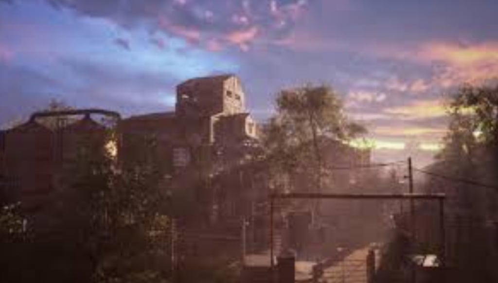
I think a similar kind of lighting as in these could work, if it was made a smidge darker (bit after the sunset so you can't see it anymore, but it's still not pitch-black, like Dead Dawg), and fog was added in, (since TCM has no fog anywhere) it could look good.
1 -
Forsaken Boneyard is the name of the realm.
Eyrie of Crows is the map name.
I would add a sandstorm into the map, so while the map is brighter, the visibility is very small.
1 -
I want a return to night time either way, don't know why they decided the middle of the day with brilliant sunshine is ideal for a horror game.
Again, no hate on the artists as that is one thing DBD really does excel at
0 -
I get it. I guess they went for the... dilapidated... vibe and the sunny lighting helped highlight it more or something, but it does look off.
Another realms they did this with are Haddonfield and Crotus Prenn. Both look so boring and so soulless, even though both had amazing lighting in their OG versions. Drowning them in light was NOT the right choice.
2 -
Sandstorms would be awesome. I thought about it adding something like that too.
1