http://dbd.game/killswitch
Like are we Serious RN?


bhvr…… what is going on over in the art department rn? Is everything okay? Why is it it takes one singular person who did this for fun, does this Dredge skin justice, JUST like the concept art?
I don't understand your guy's philosophy of over-designing everything instead of keeping it Simple and Clean (*Kingdom Hearts ref lol*)
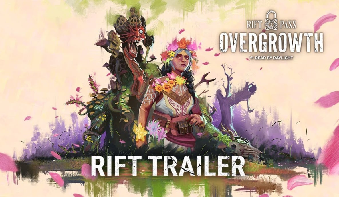
I say this out of love because the art team is genuinely amazing at what they do, but please, there's no need to always over complicate things when designing cosmetics. And even this month's new Rift reflects that. I know you guy's are the best, and are the backbone of DBD's success. 🙏 So please, rethink this dredge skin over.
Comments
-
I can't tell if this is positive or negative feedback
0 -
I think it really comes down to three details for me:
-Dirty Cloth for fabric instead of the concept art's sleek linen. Muddies the overall aesthetic.
-Mass of mouths and hands underneath the sheet ghost. Rigid, shows off too much and is too visible.
-The extra set of scissors that:
a) can't be used to attack ingame
b) cause the unnecessary screen clutter
c) aren't in the concept art
d) hide Dredge from seeing his adaptive Lantern (WHY)
I think everyone is on mostly the same page here. The concept art was perfect, they should just try again and stick closer to it.
5 -
They blew this one but I think their art team is fantasic. I'd buy prints of a lot of the concept and promo art they release if they were available. These recent ones are great.
 0
0