Petition to Revert the Logo Change

Pls, revert the change.
Do not oversimplify the DBD logo, I liked the old one :(
EDIT: this is what I'm talking about
Thanks to @PureDoctorMain


Comments
-
I personally dont care about the logo. If they get more money that way, its fine. They should work on the game more, but its different people anyway.
2 -
I liked the old one too but I don't really care that much
3 -
Oversimplification is what's hoppin' and poppin' these days for some reason
Some call it minimalism, I call it lazy and uninspired
8 -
-Signed by GeneralV
The new logo looks extremely bad. Please revert it, devs.
3 -
What logo change?
0 -
I don't care about the logo I just care about the state of the game.
0 -
What logo? where is this logo everyone is on about?
0 -
PureDoctorMain
The old one was very good and I liked it a lot so yes please do change it back :(
2 -
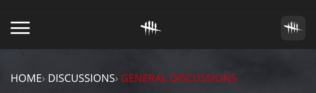
Is it the 5 line thing?
I think it is something to do with china because they don't like skulls etc. Other games have also done this like rainbow 6 and cod.
0 -
No no no no its the actual logo not the skulls the skulls are still there gimme a sec and i'll find a couple pictures.
0 -
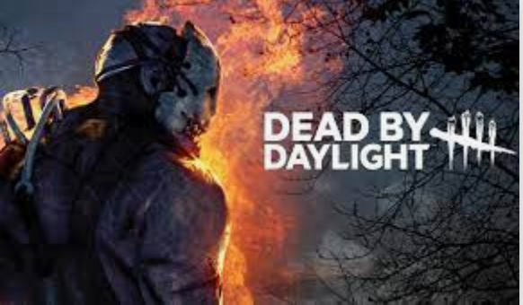
Sorry for the bad quality but you can see its a more simplified logo and it looks worse well to me at least
1 -
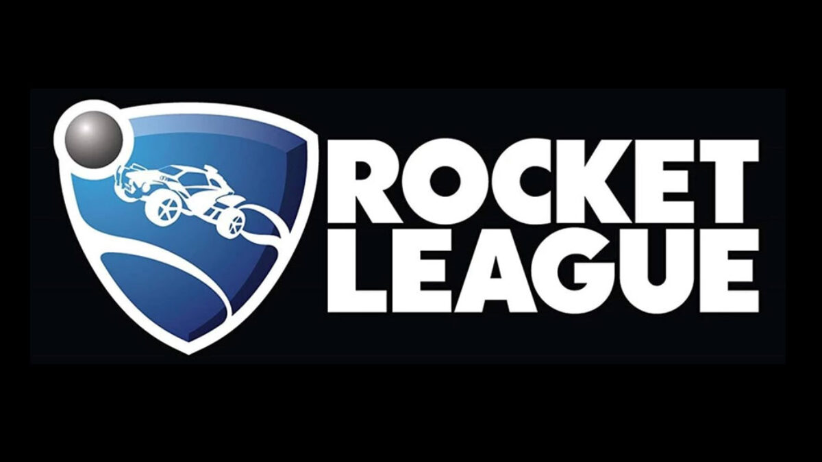
Why it kinda look like rocket league
 2
2 -
Oh no ... I feel like something bad is about to happen
0 -
Signed by DatFastBoi
can’t believe they’re changing such an iconic logo
3 -
You guys they didn''t alter the logo only altered the spacing so that the Name which is equal in screen value and matched its sizing accordingly to the logo on screen. Besides why do you guys care the games logo is barely on screen anyways
0 -
Yeah, I definitely preferred the previous iteration of the logo & title placard.
Like, why was the game's slogan removed?
If they were really keen on changing the title art, then IMO it would have been better to keep the same logo and just swap/update the art behind it.
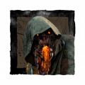
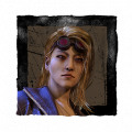
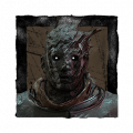
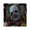
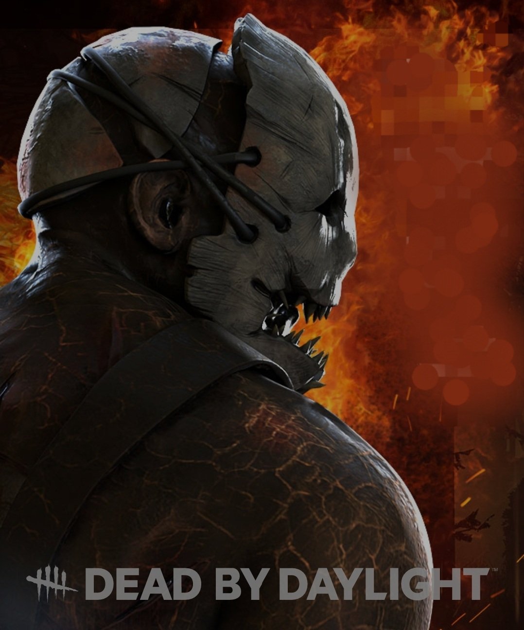
While I still most like Trapper as the face of DbD, it could be nice to have the title art temporarily updated to reflect a new chapter's killer. These are kinda easy to make anyway, since you can just slap a png of the logo over chapter art in Word and usually get something serviceable. Like so:
 5
5 -
Signed by Doritohead.
2 -
Signed by QwQw.
1 -
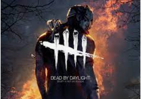
That's the first time on the new logo I've seen the skulls still there. This is the one I've seen multiple times and the skulls are removed from the logo.
Funny, on forums they have both new one without skulls and old one with skulls at the top on mobile.
 0
0 -
It reminds me of Dunkin' Donuts.
0 -
I'm honestly not bothered either way. I rarely see that logo so it doesn't really impact me.
0 -
Is this having some direct impact on your finances, career, health, relationships, etc.?
Is this really worth expending mental energy on?
So they made a visual change to the logo. You’ll be fine. We’ll be fine.
0 -
Calling it now. Rocket car is going to be the next killer. Hooks get replaced with goals and you have to hit survivors through them.
1 -
As long as the skulls stay in the tallymarks, I'm good with it. Saw a few without em and don't like it, dunno which its supposed to be.
0 -
Signed by glitchboi
They removed the most unique part of the logo, the skulls.
I think we needed the font to be changed to look more modern, but this one just doesn't cut it.
Companies, please stop with your oversimplification habits.
2