So about the character lighting change…

Am I the only one that really dislikes the new lighting for cosmetics and characters? Especially the bloody prestige styles. Before, a lot of the older killer bloody outfits had them covered in a bright red color that actually made it look like they were drenched in blood. Now the lighting makes the blood wayyy less red and I guess it’s more “irl accurate” but it makes the skins look way worse. Freddy and Billy are my 2 biggest examples, their prestige outfits look super shiny and dark dried up blood.


Anyone else really dislike the changes as well?
Comments
-
Yeah, I'm not a fan of this either. I was wondering if it's just me who needs to get used to the new look so it's good to know I'm not alone :')
Some other cosmetics also look more dull, I was playing Dwight yesterday and his red shirt or manager vest look honestly worse and really washed out with the new shaders. All these even look better in the customization preview.
0 -
I’m actually of the opposite opinion, I really like the change. It looks more realistic and makes characters feel more tangible as opposed to just being models on a screen. I think it makes them look scarier too.
Post edited by TheMidnightRidr on5 -
Disagree, I think the new lighting looks great.
5 -
I love the new material system, characters especially survivors look so much better on some maps.
Makes it feel less unpolished too.5 -
they look like they got covered in mud instead of blood
1 -
This change is actually one of the very few things I like about this update, but I can see how some dont like it.
5 -
It actually makes the default look better than the prestige in a lot of cases
Default cenobite vs bloody cenobite for example.
3 -
For me, it's the best graphical quality-of-life update I've seen since the Realm Beyond update (which included graphic changes to maps and survivors' faces). It should have been a part of it, in my opinion. Some characters, like Jill, Claire, and Saga, look more accurate to their counterparts because DBD didn't account for how lighting affects them before, but now it does. Clothes, materials, and faces now blend much better with the environment. The only downside is that everything seems a bit too glossy, but that's probably because we aren't used to it yet.
2 -
Anyone have a before and after pic? I'm probably one of the few people that never notices a difference until I see a side by side comparison.
0 -
I dont have a before picture myself but i found this online and you can see how faded the red looks now.
BEFORE:
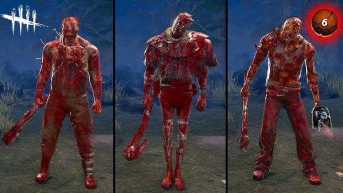
AFTER:
 0
0