http://dbd.game/killswitch
The new Autohaven Map Color needs reverting

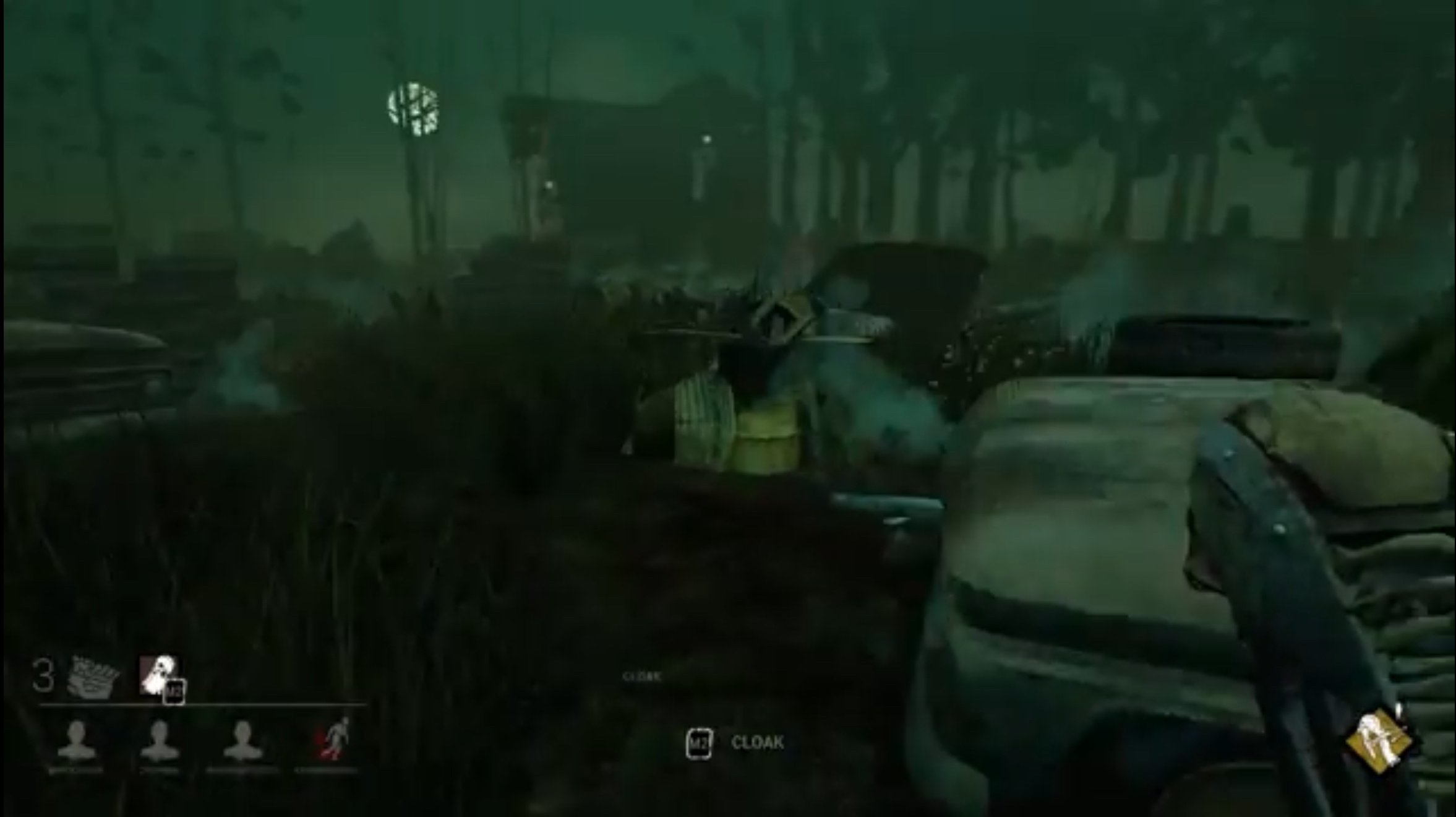
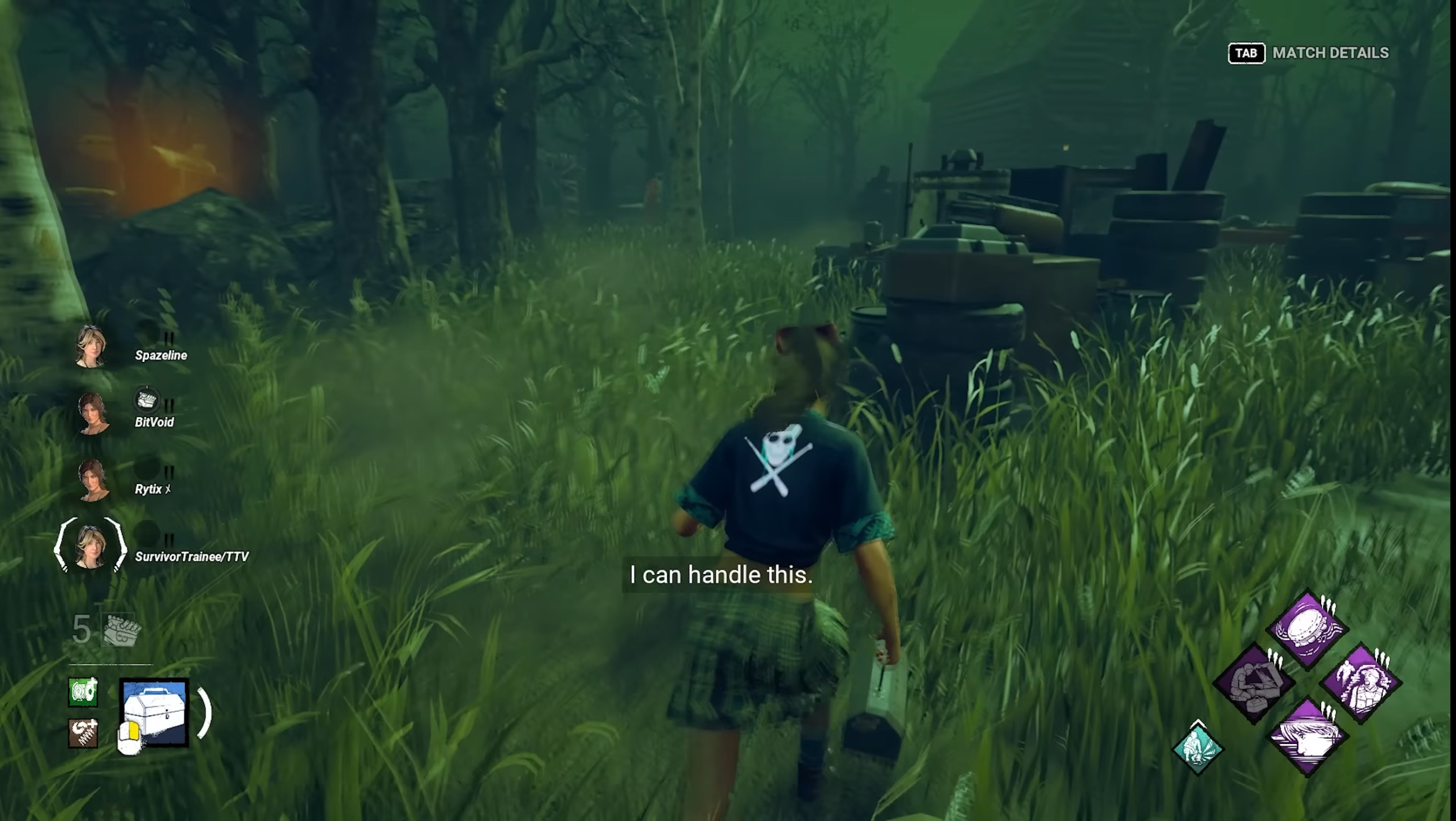
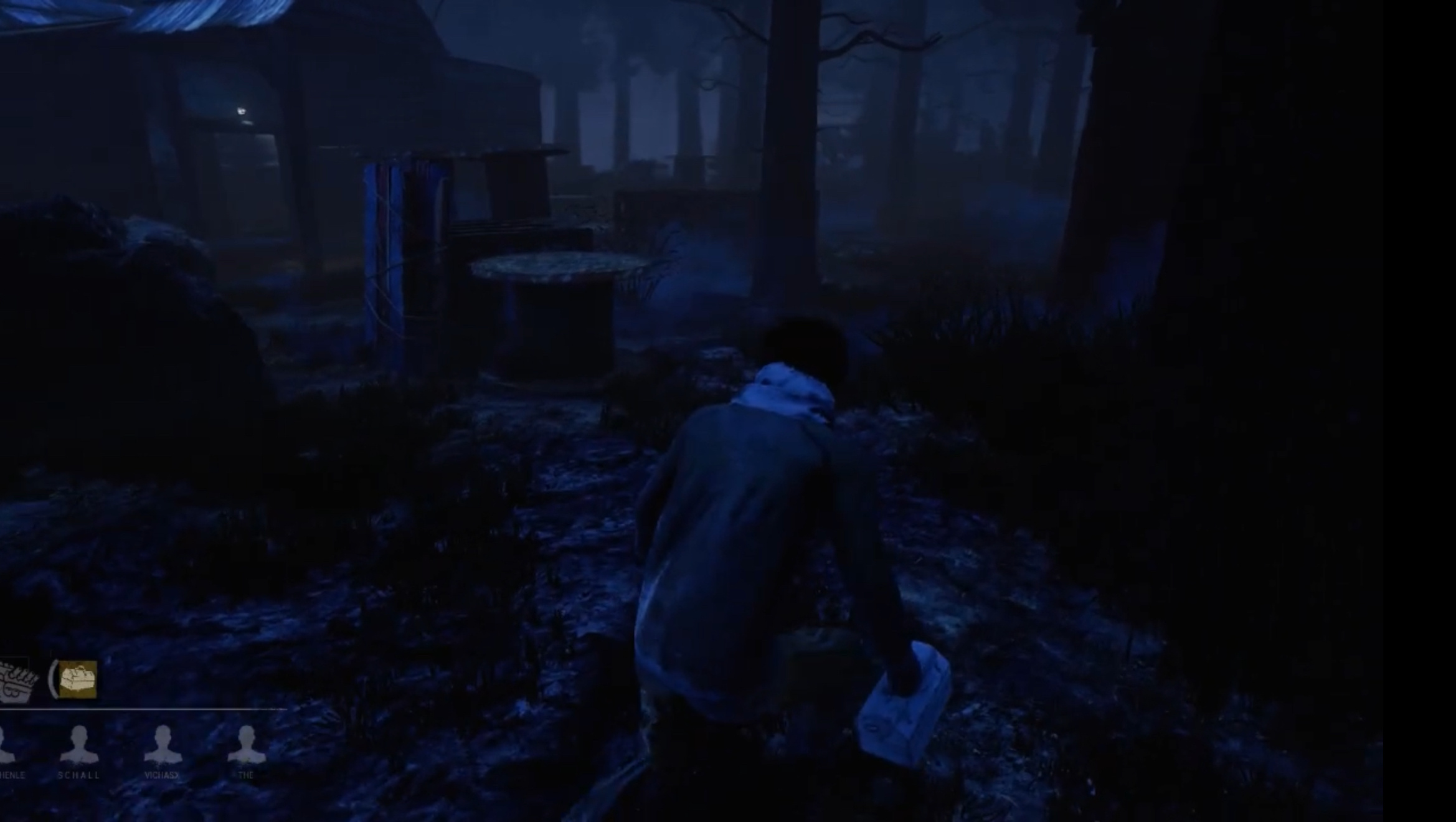
I kid you not, but the only dbd maps that feel off to me rn are the odd green autohaven maps. The blue was perfect. For some reason the new pukegreen autohaven maps even feel more zoomed in than normal maps, as if everything is bigger than it's supposed to be. It just feels distored
I really wish they'd revert it back to being blue
Comments
-
..blue....?
6 -
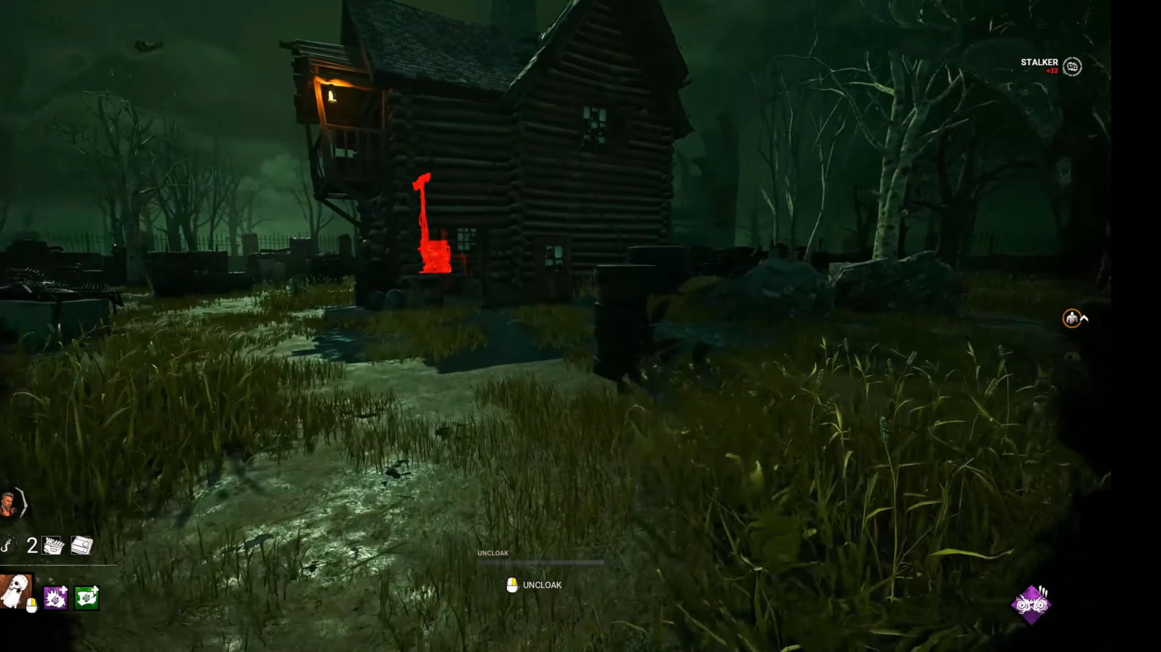
autohaven was never the blue map. That was macmillan. autohaven has basically always been green.
^ OG suffocation pit. This is blue.
4 -
I actually like it. It looks like original Autohaven, but with imroved textures.
Time to give MacMillan and Coldwind the same treatment.
3 -
agreed they turned my favourite map into a piss stain
1 -
I still can’t believe that anyone thought that this color change was an improvement over the prior version. It’s a retina-burning toxic nuclear waste green. Just absolutely horrible.
1 -
Yeah, I am not really fan of the change. I guess devs had too much free time.
1