3.40 ptb textures
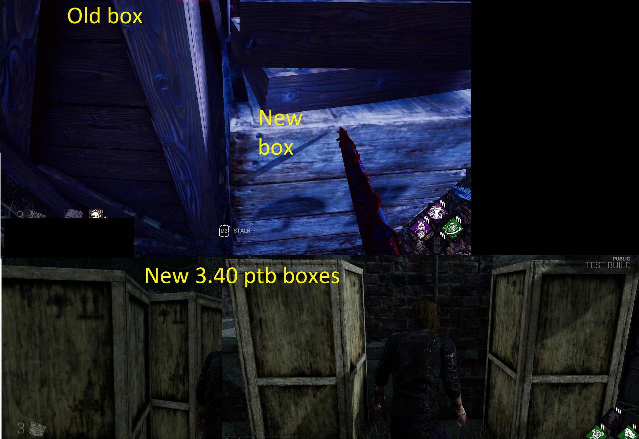
How are these updated Textures? They look worse than the old ones.
Comments
-
It looks like you are playing with low graphics?
2 -
These graphics are on Ultra.
0 -
Please @Peanits this needs attention.
0 -
Wasn't 3.4 like a year ago?
0 -
It was a typo 4.30 i posted an updated pic.
0 -
The new graphics don't look bad - they just don't blend into the environment's coloring anymore. They stand out more and are a move in the direction of more 'realism' in map design instead of the art style that had been used in the past to give maps an individual 'flavor'. Maps will look more and more similar because that's how they realistically would, and the result is that some of the textures from before will stand out more. They're moving to a more ambient, white-lighted sort of lighting system instead of this blue-tinted that has been everywhere for years now.
0 -
They could use higher res textures at least ffs.
0 -
mmm, no. I disagree. This is LESS realistic in terms of art style. The kinds of graphics present in the "updated" maps are the same kind used in Fortnite and Grounded, both of which take a cartoony/fantasy spin on realism. What DbD had before was most certainly more realistic (as close to the game engine switch as possible because the most recent patches in UE4 have had really ugly graphics for the "not updated" maps), or at the very least more realistic in a different sense. There are a number of different reasons a place might look excessively blue, and that might have to do with how the light reflects off of the objects there or how the sky (after all, this is not the "real" world) affects the light.
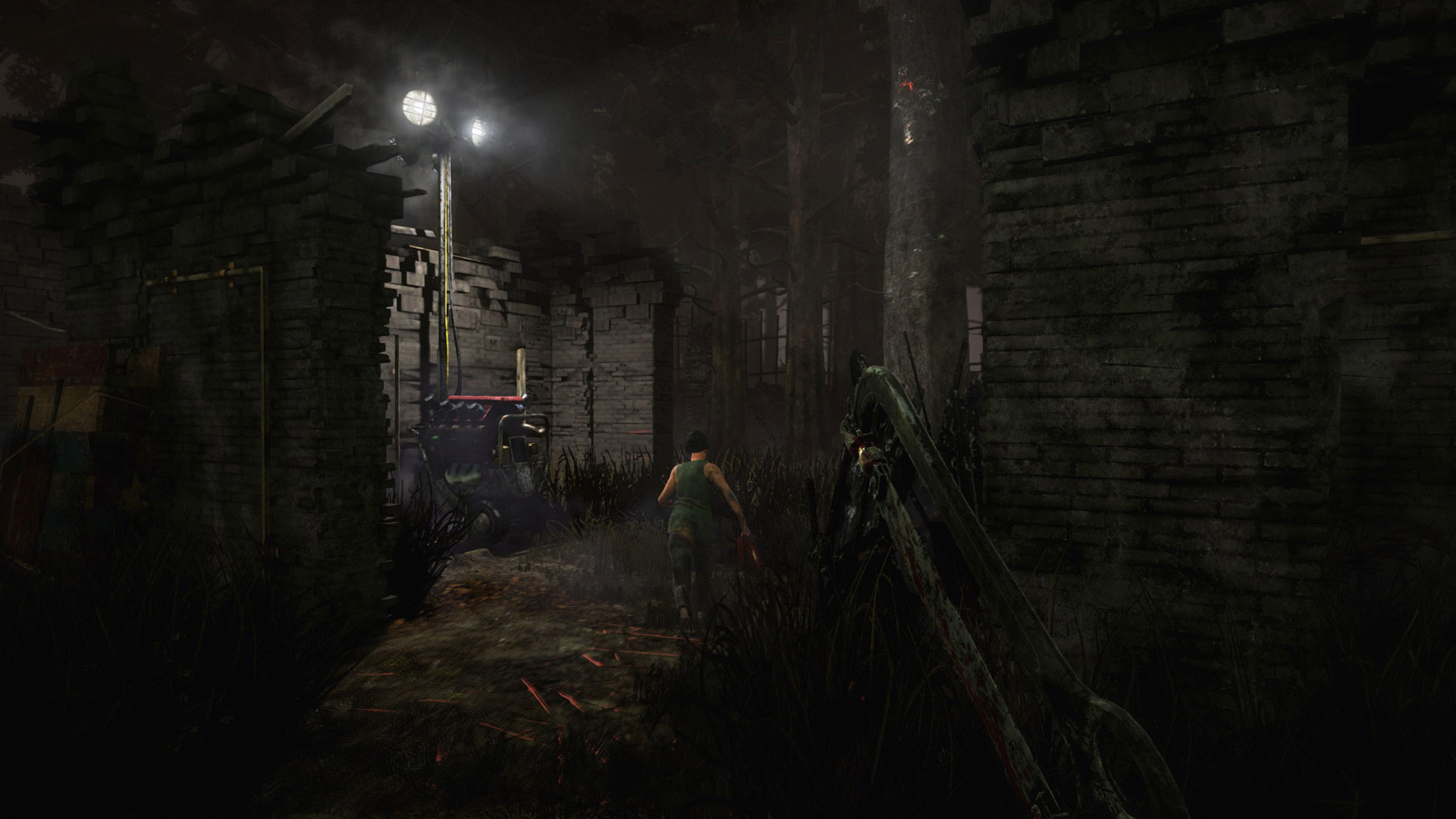
I'm very against the graphics change because in addition to it just not looking significantly better than DbD in 2016 (see picture below), it causes me to severely lose frames. The changes add nothing beneficial to the game (other than new marketing opportunities, and that's for BHVR's moneymaking department) and only (poorly imo) remedy what was falling into disrepair for several years now.
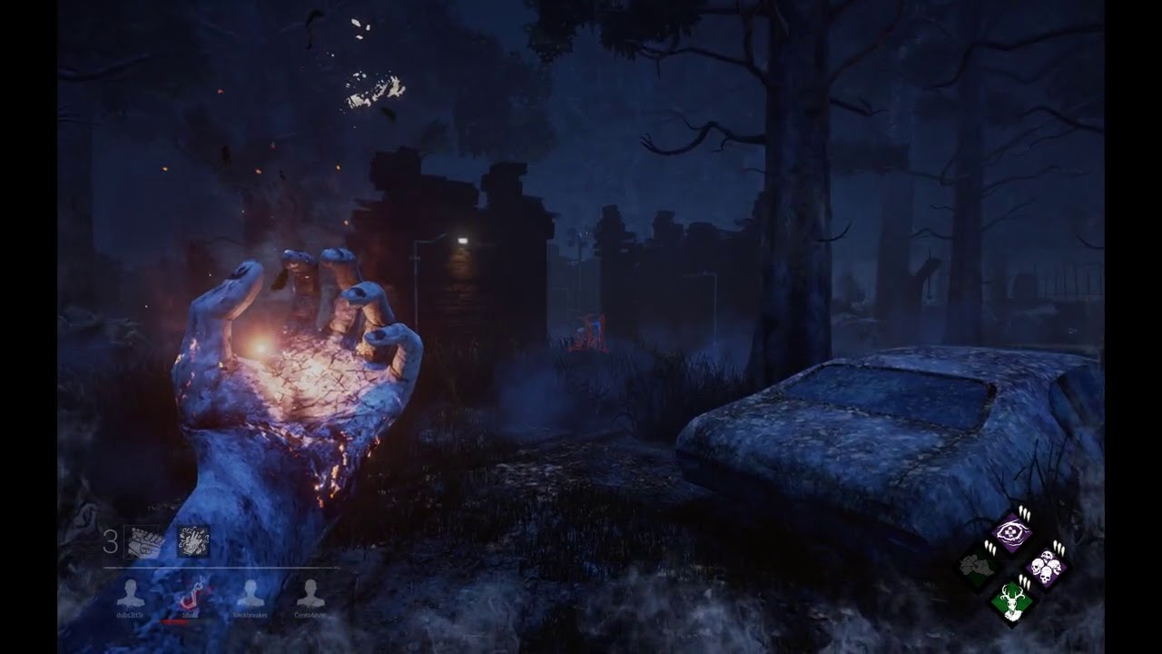
I would be ecstatic to see these visuals in the game. Particularly in the last shot, note how the car doesn't reflect light like some kind of toy abomination freshly painted and minted out of the factory (unlike the cars on Badham). It even looks like it has experienced some wear and tear and was actually made from the memory of someone (which according to the lore, it was).
And look at the grass! It's not a scratch mark abomination since its so thin (and is certainly more realistic than the grass we have going on now).
0 -
Also take into consideration a lot of the graphics changes are to disrupt how well Survivors blend into the environment (because... they're just incapable.. of removing or brightening cosmetics or some reason). That last map looks god awful for any killer going against a Claudette or dark, blue-toned clothing Survivor.
To be fair though - this game really does have subpar graphics for an Unreal 4 game, compared to other games on the market using the same engine. A lot of it, I think, has to do with it being split between consoles - they can't use purely high-res textures and such that the normal PS4's cannot render, for example, but Pros would be able to. Situations like that.
It unfortunately isn't where they can go full-ham on the graphics and have truly immersive realism because some systems just can't handle it - so they compromise.
0 -
In my opinion, as a person who has done texture work and modeling for games for 10+ years. The maps on the "old build" are currently distinct in their colour tone, by this I mean look at Coldwind farm and notice the Yellow feel from the crops and Hay, I've noticed on these later updated maps that feels is completely gone. Macmillan has a blue cold industry feel, indicating it was long gone and abandoned in the "old" map. After playing on the newer style of map I've found these tones have completely vanished from the maps. The all feel similar, with only the landmark buildings distinguishing them apart. Movies/cartoons/concept art do this consistently to tell a story and using the UE4 engine there is no excuses, you have that power to make these maps spectacular and it appears your also reusing the same texture placements on most if not all the brick/cement textures. I understand your on a deadline but that needs to be varied up, along with these crate textures, the variety and tone of these maps has diminished greatly from their older counterparts. No highres models or textures can hide rushed work (i wont mention that awful door, its embarrassing and is a blight on your talented artists.
0 -
it wasn't actually all that bad going against Claudettes, at least any more than it is today. Rather, all the other characters (Dwight in his white shirt, Meg, etc.) all blended in better so that is was less impossible to hide as those characters as compared to Claudette.
This screenshot clearly isn't from me, but it highlights how Dwight's texture blends in better with the material of the environment, and when Dwight's put up against the shack wall, it's even clearer that in 2016 DbD, hiding was expected from all survivors and made easier because killers could miss each survivor if they weren't paying close enough attention.
Even if they are compromising due to different platforms (my computer probably couldn't handle the full force of UE4), there's no reason it has to look as ugly as it does now on low graphics or that they have to abandon the art style they've been working with for so long in favor of something more cartoony. I sincerely do not agree with their decisions.
0 -
I don't know. I don't see the changes as terrible and I prefer most of them so far - especially the changes to how completed generators light up the immediate area. If anything needs changed though, the Game map on Killer-POV is way too dark.
I'm torn on low graphics - if your computer can only run low graphics, then okay I understand; if you're abusing low graphics setting to make it easier to see things, then I have little to no sympathy for those people.
0 -
This is what my game looks like on live on the current Macmillan maps.
This is what my game looks like on Badham. Actually, bad video. I don't know why most of it is so stutter-y. My game only had 1/3 of that. The part I started the embedded video at below accurately reflects what I saw on my end.
I'll try to find an image to display. I have around 6-13 fps on the "updated" maps, and they look just as ugly.
0


