http://dbd.game/killswitch
Whats your thoughts on the upcoming UI changes?

looks kinda like a mobile game... but im glad they add atleast a UI scale option since it would take a lot from the screen
Comments
-
I hate it.
Information is all over the place.
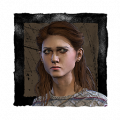
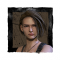
The portraits are already ugly on the character selection screen, why add them to the HUD as well? I'd be 100% more happy if they used something more simple like the achievement drawings.
19 -
The new information it presents is great. The placement choices are strange, and I would prefer that everything stays in the lower-third so that you can scan it easily. I dunno why they decided to move everything.
3 -
The additions are great, the layout i can definitely do without.
6 -
Not the biggest fan, it does have that ugly mobile game feel, everything is all over the place, they just removed the creepy and simplistic feel of the old HuD with those colorful icons, it would be much nicer if they used the Adept Icons...
6 -
Hopefully they'll listen to feedback and not use the excuse of "well nobody likes it because they're not used to it yet"
7 -
I love the addition of the hook stages, but as most people feel I agree the placements are all over the place when everything looks better when it’s more together.
Honestly it would be way better if they keep it the way it already is but just add the hook stages next to the person’s portrait, and replace the portraits with the adept icons. Have it flash red if they’re injured, have it be solid red if they’re dying, and just replace with a hook icon if they’re hooked, then have the skulls if they’re dead.
1 -
Adept Icons would def look better than the coloured ones. Lets see what happens
0 -
The extra info is nice.
The spaced out layout is atrocious.
The injured icons are hard to see.
2 -
There are a lot of posts on this already. Most of us hate the new UI. Yes it looks straight out of a mobile game, it looks messy and all over the place. I also dislike the character portraits-- don't get me wrong, I like that they're adding character portraits but the ones they've shown are too colorful and look out of place. Hopefully they're just placeholders.
3 -
More information is great. I often have troubles remembering who i hooked before.
The layout is a bit all over the place but people will get used to it in like a day. Overal love it
0 -
Would be nice if we could unlock it and place the UI elements where we want them.
0 -
Awful. It looks horrendous, and the placement of everything is really bad compared to the current UI. It is way too bland and way less stylized.
0 -
I am 100% certain they will ignore all feedback about the UI being cluttered and push it out anyways.
They like to say catch-words like "this is a work in progress" as if that means anything. Same things they have said about console optimization, Early Game Set Up, and problematic perks.
No one asked for UI changes. But here we are. Are they really going to back down and say "You're right, it was a mistake" or double-down?
I have my suspicions.
7 -
It feels uninspired, and too spread out. I don't want to have to look in 4 separate places to get critical info for the match. The new UI feels like something from a mobile game.
The old UI is better because it sticks to the gritty style DBD is known for. While keeping all important info conveniently in the bottom left.
4 -
I don't mind it tbh. then again I'm just tired of the old one.
0 -
Sarah mentioned in the Dev Tapes that since they’re going to be adding more features in the future, the Ui layout had to be changed to accommodate them all as they arrive in-game.
I personally don’t want a entire border around my screen filled (cluttered) with icons and animations.
Not my style.
2 -
I don't like it cluttering the screen by scattering information all over the place. It reminds me of when I was a kid just trying to fill the edge of a poster for a project to make it look like I did more than was actually there not realizing it just looks disorganized. Putting information all over the screen also takes away from any immersive feelings in the game, especially when the visuals look so out of place. I don't like that it is creating blind spots in the FOV, even if you change the size there will still be a blind spot where the information is sitting. I'm worried that it is also going to increase triggers for fps drops on console and low end pcs. I also feel like choices they have made completely ignore the colorblind community that has been very vocal asking for accessibility options - rather than take that community into consideration to avoid adding features that will further put them at a disadvantage they are replacing current features they can use with ones they cannot.
The current UI having all information neatly at the bottom not only looks better but works better for checking on information quickly while in a match. Being at the bottom it also avoids blocking anything in your FOV.
1 -
It's the ugliest merde I've ever seen
2 -
Hate it. The only good thing about it is seeing which character is which player.
Besides that, everything is awful. Why is # of gens in the middle of my screen at the top? Why is the character list UI a drop down vertical list over horizontal? I see what they were going for but like so many things, the devs change what isn't needed or asked for.
4 -
Keep everything in the bottom and give survivors an individual hook counter. A general hook counter tells us nothing.
2 -
I'm fine with the majority of the changes, but moving the survivors from the bottom left to the top left is gonna be a royal pain in the ass. Gens at the top is fine - it's in line with a lot of games with objectives. Would I rather have it at the bottom? Probably.
Survivors should be able to see each other's hooks - the killer should not. All that does is encourage a killer to tunnel more.
0 -
Looks like a mobile game ui, not looking forward to it tbh hopefuly there will be a option to use new and old, I feel the writing and pictures just take up space that’s not needed, showing how many gens in the middle of the screen is distracting it’s fine being at the bottom left
1 -
Ugly, and pointless with no more information than I have now.
Killers don't get to see who has been hooked, that info is only for Survivors.
0 -
I find the current one very visually pleasing and I don't like how cluttered the new one looks. I really hope that we're able to select which UI we want to use that way everyone can use the one they prefer.
2 -
The UI was designed off the assumption we have 4 eyes that can all focus on different things at once.
This confirms my theory that BHVR are actually aliens.
3 -
I really don't like it
2 -
badly done, and they were super exited about it but it's just too much, i feel bad for "her" she seems so proud of it but it's just bad
4 -
There’s just no way this was done by a professional UI designer. Looks like it was done by someone who just got into UI design, so many beginner mistakes.
3 -
I really like it, but I can also see why others dislike it. I think the devs should add the new features to the existing UI to save people getting frustrated with things being kind of everywhere.
0 -

Lol i thought these numbers were the amount of hookstates but it's just part of the name.
Nvm hate the new HUD
2 -
The portraits is what I like the less, they don't match very well with the other UI elements. Everything else though, I think I can get used to eventually.
1 -
i didn't want to say that but yea clearly fresh out of school or something
1 -
The hud is really bad. They should have just kept old layout and added lallies at ppls names
1 -
But if the killer is memorizing the different hooks people are on and is gonna tunnel anyway, then what's the difference? It's just a quality of life update for killers is all.
0


![[Deleted User]](https://forums.bhvr.com/applications/dashboard/design/images/defaulticon.png)