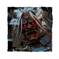
Trapper Needs a New Icon

This icon doesn't do it for me (and probably a few other people, too). This just doesn't sell to me that this is The Trapper. He doesn't look intimidating or there's some emphasis on his iconic feature (the mask).
He's not engaging the player or trying to look scary. He's just...there?
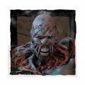
The old one looks better.

It's more intimidating, puts an emphasis on his big old smile in that mask.

You guys even have a good render to base his icon off of. I'd much rather this be used as a reference or even just the icon itself rather than what we've currently got.
He's the poster boy of DbD. He needs a lot more respect.
Comments
-
huge agree,he got nerfed
0 -
A lot of them are just…. Weird. He looks like he’s modeling at a portrait studio.
0 -
He's just distracted
0 -
I main Trapper and I like it
0 -
He looking left cause BHVR don't treat him right
0