http://dbd.game/killswitch
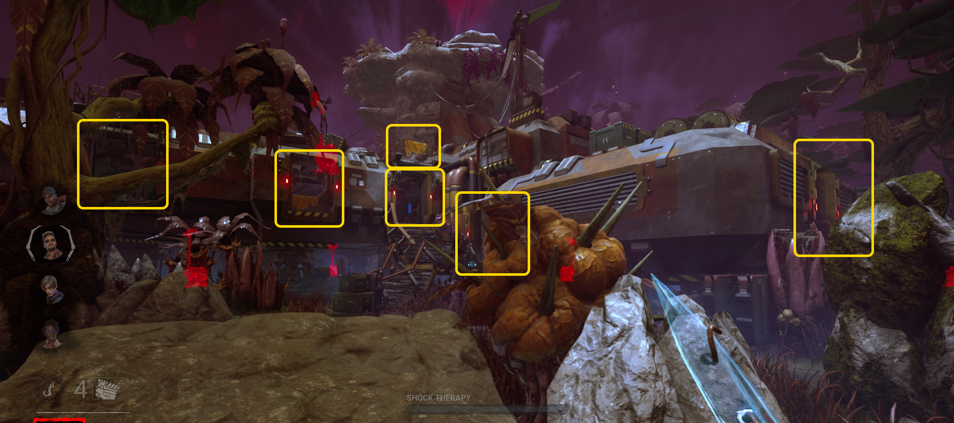
Toba Landing (Dvarka Deepwood)

We'd like to know what you think about the Toba Landing map, part of the Dvarka Deepwood realm. Please leave any feedback you have concerning this map as a comment on this thread. Your feedback can be as brief or detailed as you'd like!
Toba Landing (Dvarka Deepwood) 283 votes
Comments
-
Who ever thought it's a good idea to make a map this dense and claustrophobic and hard to navigate, I hate you. The colour is bad, the walls make it very hard to identify tiles, the gates are impossible to see. One of the worst maps ever made if not the worst.
17 -
Same problem as reworked red forest, too much clutter very annoying for range killers due to hitboxes, playing this map I feel claustrophobic and it's hard to navigate most of the loops are short for survivors and tough for killers. The only thing I like at this map are the aesthetics
Post edited by gothbave on15 -
The map is still too red. Red scratchmarks, red pools of blood, and red auras, need to be much brighter and vibrant on this map, so the red map isn't a massive killer nerf the entire game.
Alternately, give killers the ability to pre-set aura colors per map, so we aren't stuck seeing red on red.
5 -
I don't think it is Survivor-sided because of two significant problems.
- The filler loops are generally unsafe. There are a handful of strong spots, but since most fillers are unsafe and most players aren't loop gods, I don't really struggle on this map. If I end up losing, it'll be because of how large it feels. The main building makes navigating to opposite ends a bit awkward at times. The dense clutter makes stealthing Survivors hard to find at times too.
- There is poor visual clarity on this map. It is very difficult to tell where the pallets and vaults may be. There is no distinction between naturally-occurring fauna and the loopable structures. I want to be able to tell at a glance from a distance where I may need to run.
I don't enjoy this map as Killer or Survivor.
7 -
Extremely cluttered map, where it is often difficult to tell where you are in the map.
3 -
Cool aesthetic, but too confusing to navigate. Also some loops are very unsafe, and the main building makes feel this map too big.
2 -
I really like this map. It's very small and very easy to navigate, since main building is always visible. Provides plenty of cover for stealth but there aren't a lot of places to really go and be sneaky, so it's a nice balance.
The main building is really fun to play, probably my favorite main building in the game. There are plenty of opportunities for mindgames and creative pathing, as well as outplaying survivors with your power (especially at the big drop). My only complaint is that the scratchmarks can be hard to see but other than that, it's my favorite map in the game.
1 -
If it wasn't for the new anti-3-gen mechanic, I would have said this map is """balanced""" (now I'd say it's surv sided because of how big it is) because of how close the gens in the middle are. There can be one down the stairs of main building, one on top of it and on between the shack and the main building. It's painfully close and extremely hard to get rid of as survivors if you don't jump on one or two of those right from the beginning.
Before the anti-3-gen, a Plague player burned an offering for the map and would constantly patrol those three gens while using Surge and it was simply impossible to do anything in solo queue.
Now the problem is how hard tracking is on this map and also how boring main building is... it has one pallet, one super unsafe window and one good window. Not much to have fun with, honestly.
0 -
Horrible. Too bright and colourful, pallets and windows aren't really visible. So confusing too
2 -
This map is alright. It's not too big and the main building gives both sides reasonable opportunities to succeed.
I like the one-way ramps on some of the loops.
Overall balanced.
0 -
I hate this map.
As @GoodAvocado said, it's very difficult to distinguish loops and tiles (which are very very unsafe) from the real fauna on this map, so the navigation is quite rough. I have difficulty distinguishing colours as I am also colour blind, so it is also difficult to trace scratch marks and pools of blood.
Moreover I think this map is a little to small and that's one of the reason why the gens setup is very rough sometimes, they can spawn very close in the main-building zone.
0 -
This map I think is a survivor sided map, cuz of the janky collision and the tile chaining and half of those tiles are really confusing and a lot of clutter plus the map building I absolutely dislike with those pallets the one in the main building and the one outside the main building underneath
0 -
The map is too bright and colorful, the amount of clutter and natural camouflage make it super easy to play stealthy and because of the exorbitant amount if line of sight blockers you oftentimes arrive at a generator where the survivor might be God knows where and you just cannot afford to look for them. So if the survivors decide to play stealthy you just wander around without finding a chase.
It might be easier to win on as survivor but it still is not really pleasant to play on, just because of how hard it is to identify tiles oftentimes, because of the colors everything just overlaps and pallets and windows which are usually easy to spot just become somewhat hidden.
To fix the issues remove the clutter, make it more open, tune down the colors and make tiles a bit easier to identify.
1 -
The map is surprisingly decent balance-wise, but it doesn't matter when you can't look at it without having your eyes constantly strained from the color scheme. Please make the colors less intense for this map. And also clutter, this map has too much clutter.
0 -
This map is the last of the 3 maps that I will BEG you to change the color on. When I load in, because of my poor eye sight I cannot see scratch marks at all. It's absolute misery.
I also love that you guys went for unique loops on this and Nostromo, but respectfully, you did such a POOR JOB of outlining what those loops are that nobody knows how to properly run them, so they just predrop or lithe to shack/main, because the loops are so weird.
I've said since the arrival of this map that if you made the actual looping STRUCTURES the same kind of like "alien stone" that you have on shack/the exit gate, then still had flora/fauna of an alien planet around/near those things, this map would be 100x better. I love the idea of the little ramps, etc...especially as a balance landing gamer, but...still the other loops make no sense 90% of the time, because it's not obvious what you're expecting people to do with them.
Main building is a nightmare for certain killers. Not because it's overly strong, but for killers like Wesker, you can't even use your power properly at it, you're just stopped.
Above all..please please please change the color scheme.
As others have said, way too much clutter, and the collision is suffering.
If you want to stop every survivor from feeling like they have to run Windows of Opportunity to not feel confused on maps like Nostromo/Toba, you've gotta fix the huge issue you have on those two maps and make the LOOPS more obvious with a different kind of material. Like I said, alien stone, with perhaps a slight blue glow on it for Toba, and Nostromo you could literally make it more pieces of ship wreckage for the majority of the loops, but have surrounding stuff be the stuff you're currently using.
Until you do something like that survivors will hate the maps and collision based killers will suffer.
1 -
I really enjoy Toba Landing! After taking the time to really learn it, it's become my favorite map to be added to the game, both aesthetically and gameplay-wise. It's beautiful and atmospheric, the sounds of the alien jungle keep me on edge (perfectly fitting for the horror atmosphere!), but it also has many different distinct sections of the map that allow for different types of gameplay throughout! I love that within one map, I can switch up how I play anywhere on the map and play into my various strengths on different characters. In addition to that, the map doesn't feel like it has too many incredibly strong connecting tiles; most tiles feel like I can play around them on both teams.
I love that there's a more barren desert area, an indoor area, and a more claustrophobic jungle section. On PTB, the jungle section felt like an outdoor-skinned indoor map! It filled a very unique niche in Dead By Daylight's repertoire of maps.
The jungle section provides ample opportunities for Killer and Survivor stealth, and tricky teleporting Killers to disorient Survivors!
The open plains with open sightlines prove a killing floor for ranged and mobility killers.
The main building is fairly balanced, and M1 killers have a consistent structure to play around (in addition to extra stealth opportunities for both sides).
There is truly something for every character on this map!
Because there are 3 distinct sections of the map, and main always spawns in a fixed orientation, it's really easy to orient myself and not get too lost in the winding jungles or rocky plains.
Since PTB, obstacles have been stripped from jungle-side, but I understand it made navigation difficult. However, sometimes (especially dependent on the RNG of tile spawns), I wish there weren't clear strips of wide-open sightlines in the back of the jungle where the variable tile can spawn (Venus Fly Trap or Truck), because as Survivor this area often feels like a complete death trap if the Killer comes your way, and almost nowhere to hide - there is often only one pallet that can be used in this area, and after that the area can sometimes feel very barren, where I can see straight across to main building:

The giant venus fly trap plant is a really cool global broadcast effect that alerts players to another player's presence, and that hasn't been seen since Backwater Swamp. I like this detail, and using it to my advantage to either find victims, teammates, or to let me know where to stay away from foes.
The glowing blue flowers that grow on EVERY generator make finding generators incredibly easy as Survivor; I never get too lost because the flowers light my way!


There are many "one-way" sections of the map, like little ramps and dropdowns. These are very interesting areas, that create unique gameplay moments without being too invasive to regular gameplay, and I enjoy playing around them on both sides.
The tiles on this map feel very fair to play, nothing ever feels too strong to chain together, and the D'varka maze tiles especially are unique and very fun to play around!
The shack is ample-ly isolated/far removed from strong connecting tiles - there is plenty of distance from shack and any adjacent structures, so it can't be chained too strongly. Even though it's next to main, there are no strong resources on shack-side of main to chain it into shack with.

The main building on Toba is the most fun main building to play on the entire game on both sides! There are so many winding alternative pathways for either side to take, dropdowns, and cutoff shortcuts - like swiss cheese. This main building has so many possible combinations to run, it's constantly an exciting battle to be there, or to cut off a survivor from a direction they weren't expecting!
All of the entrances, exits, and vaults are highlighted by small lights on the building, making it incredibly and easily apparent what I'm looking for without having to strain for it.
Just look at the amount of easily-readible holes of swiss cheese that are available just in this one glance alone! The lights are a brilliant touch of level design, and this image exemplifies the many opportunities for chase routes available just from one side of the building alone. Plus, hidden just out of view is the tunnel underneath main - 7 whole routes to take and cut off with!

Regarding discussion about Toba Landing, since its release I see a lot of complaints throwing out the same buzzwords like "clutter" and "color palette," but I honestly feel a lot of these complaints are leftover rough feelings from Tools of Torment's release, because multiple changes have been made to the map that have greatly improved frequently-cited complaints, yet the same things are repeatedly complained about despite the fixes... The miscellaneous bodies were cleaned up and there is nothing to trip on anymore, the map has consistent contrast and a reigned-in and dull purple+gray+brown color pallet, navigation and foliage has been cleaned up and made incredibly clear what has a collision. Additionally, the grass effects were made thinner from PTB so that Scratch Marks are clear and easy to follow, without getting hidden in tall grass.
It feels like many complaints haven't actually played the map since PTB or initial release, or given the map the chance to be learned. Many players in the beginning would insta-DC or die-on-hook just to literally refuse giving the map an opportunity to be learned, even after changes were made.
Many opinions on Toba came from the same era of stubborn hatred Skull Merchant received (and continues to receive to this day), also hot off the heels of frustration towards Garden of Joy, Borgo, and Eyrie. So to a degree I'm not sure there's any amount of fixing that can be done that'll appease everyone, as many complaints seem to be recycled from the beginning that ignore the real changes that have been actuated to make the map better to play on for both sides.
Post edited by NotJared on2 -
I actually think this map is very cool and gorgeous. I defer to those who have accessibility concerns, but I do hope those can be addressed without taking away from the unique, alien atmosphere of the map. I also think the little loops with different elevations are very fun to play, and the main building is interesting to play on both sides.
I did encounter something weird with the lighting on the main building basement last night, where when I looked up the stairs... it was just a void of complete darkness! I couldn't see anything until I'd come all the way back up and outside.
0 -
Too dense and too saturated. Pretty much the opposite to Nostromo in that regard. And that’s double weird as they belong to the same realm?!! And have different offerings.. I do not like the inconsistencies here. At all.
map is otherwise okay I think? Layout and atmosphere are good, alien life forms and stuff are kinda interesting without being too distracting.
1 -
The colors on this map make playing on it frustrating. Scratch marks start to blend right into the ground, and there's so much stuff on screen at any given moment that I actually end up losing track of survivors very easily.
0 -
Toba Landing is the original map from the Dvarka Deepwood realm and it introduced many charming features like plenty of small slopes or the alien flower landmark that opens itself whenever a player is within the tile (giving long distance information to aware players). The map improved a lot after its release by reducing the clutter but it seems like many players are still troubled by the many obstacles as well as the saturated color palette (which may blend with the scratchmarks and auras).
Some of the filler loops have weird shapes that while mostly being okay, collisions sometimes get in the way. The filler loops also spawn windows in this realm and they can potentially create set ups with other structures.
There are only 3 mazetiles so the predictable safety of the map is questionable. One of the landmarks is connected to one of the mazetiles, depending on the types they can form a very powerful set up.

The jungle gym of Dvarka Deepwood has one variation with the pallet next to the window, despite it being the official jungle gym and not an instance of the "impostor gym". This pattern of window and pallet is not exactly new, it was once a bug on a PTB for all the jungle gyms in The MacMillan Estate. This iteration makes the tile less interactive and it is not favored by the players.

The pallet gym of Dvarka Deepwood is highly peculiar given that half the time it spawns an insanely powerful window that singlehandlely shifts the strength of the safety in the entire map (since it doesn't always spawn and half the time it is missing the window). The finest survivors can stay out of chase and vault the window without blocking it.

Toba Landing needs to polish some collisions (maybe adjusting the friction), relocate the pallet on the weird variation of the jungle gym, reconsider the strength or logic of the window at the pallet gym and add a 4th mazetile while separating the landmark & mazetile set up in the layout.
0 -
Too much colour. Too much clutter. Too big.
Almost exactly the same as the Nostromo review. The only difference here is that the tiles are more in the style of Garden Of Joy. Safe, with no mind games to them.
1 -
Too big? How on earth is Toba too big, it is one of the smallest maps in the game afaik.
0 -
The map has a lot of unique tiles which I really enjoy but the color pallet makes it incredibly hard to even see whats going on. That combined with the sheer amount of clutter make it impossible for me to see auras, survivors or objects even if they are right in front of me when im playing killer.
0 -
What's great about Toba Landing:
- Relatively good main building.
What's bad about Toba Landing:
- Very difficult to navigate for newer players.
- Overdid the plants. Needs to be more obvious where the walls of the lower loops are.
- The little rock ramps are a fun new idea, but they're so short that I'm not sure if they even benefit or hinder either side.
Suggested changes:
- Needs a more identifiable landmark on either side of the main building so survivors know what side they're on.
- Put line of sight blockers next to the ramps and a pallet next to the drop and make the ramps a little taller so they can create one way mind game tiles.
0 -
Way too many random objects that block vision and hinder mobility for killers like billy and blight
0 -
Bit painfull for range killers, too much junk everywhere. But other than that fair good map.
0 -
I can't see pallets on this map, because it is too colorful. Also the weird bubble texture for the gym walls is really confusing. I often have a hard time to recognize the type of loop I am at.
Also too much (visual) clutter.
1 -
The map feels like absolute color vomit and too much clutter still. Collision is pretty bad too. Also main is too strong
1 -
If you dont bring nowhere to hide or any other aura reading perk as killer, you are screwed
too dense, too much fauna, the map size and tiles are okay i guess
0 -
While it's a bit hard to navigate the first time, it's not really that big, though like other maps, there could be some unnecessary clutter, other than that, that's about it.
0 -
Just like the Alien map, a complete cleaning could be done here, there are many obstacles in the middle of the map that hinder both the killer and the survivor, with terrible hitboxes, and difficult to locate loops due to the lack of vision.
0 -
please stop cluttering the maps, it has been a trend that no one likes afor a while now but toba brought it to a new extreme. you literally can't see anything on the map
0 -
The general balance feels fine but the odd shaped walls are the worst and make it very hard for some killers to use their powers.
0 -
tbh i really enjoy Toba Landing. It's a little bit Survivor sided, as I feel like there are many safe tiles and stealthing on this map is very easy, but overall a great map.
0 -
Map is fine design wise, it's just kind of a sensory overload. A whole bunch of bushes and plants, many of which actively make noise make the map feel very claustrophoc despite being outdoors and can just be really overwhelming at times. The design of some of the tiles can also make it difficult to distinguish what areas are actual tiles vs just a random splotch on the map
0 -
Love space themes and like this map. That shadow of whatever it is and creepy insects, briliant! Could be more fun loops and such but hey more space and western maps in the game please!
0 -
It's a balanced map but just very chaotic and the loops are confusing
0 -
I think it's fairly balanced from my experiences with it. Though playing killer on maps like this can be a bit confusing as many have mentioned due to scratch marks blending in. And I don't think they fully blend in (just like they don't fully blend in with the Blood Moon event) but it's the difference of seeing them at a distance or if you would have seen them as they faded out or as you glanced over an area. Instead, you might miss them because they are too similar in color whereas many older maps there's so little red that it's hard to mistaken anything for scratch marks.
And the noises can be confusing on both sides of the match. Stealth killers mess me up here because the centipedes and bushes sometimes make me think I'm about to get got or as a killer, I think it's someone's footsteps for a moment. I think once I was confused why they would drop a flashbang while on the other side of a wall where I wasn't looking and it was just the rattling-like noises I was hearing from the map creatures or fauna.
0 -
I love this map. It looks so cool, it feels unique and different and fresh, and I think the main building is really fun. The tunnel area underneath the main building and the little ramps are very cool! I really love that the map team is trying new things and making maps like this one that shake up the standard DBD map format. Yes, visibility is low due to the high walls, and I can see how ranged and collision killers would struggle on this map. I think that's actually fine though. There's other maps with lots of open areas (Dead Dawg, for example) where ranged and collision killers really have an advantage, so personally I think it's okay if there's maps they will have a harder time with too. Just my 2 cents as someone that mostly plays killer!
0 -
I feel like this map is way too big, and there's not enough pallets, so on survivor this map is a chore to play on as both sides but over all it's killer sided in my opinion, ofc i'm survivor main so most of my opinions are all in killers favour, so I advise not too over react to my opinion thanks ;)
-1 -
This map is a bit survivor sided in my opinion but not by much at all. The two biggest issues I have with this map is the clutter and how bright the map is. There is way too much stuff blocking ranged powers like huntress hatchet's and Trickster blades.
1