New survivor selection screen is still not great

First of all, I'm super happy that we have the rows of 4 portraits back, as in the PTB this was only 3 survivors as you may remember.
However, putting the newest character at the top completely messes with the order I'm used to. I know where to scroll to pick a character but they've all moved one tile now. Definitely a first-world problem, I know, but why change it. This has been the case in the store for a while too, but there I think it's fine. But not in the main selection screen imo.
The scroll bar on the left also makes little sense in my opinion. The rest, such as Customizations and equipping charms, and cosmetics, will be a matter of getting used to.
Overall however, this is a downgrade from what it used to be. It acts way too much like the Store and kind of makes the actual Store a bit redundant …
Comments
-
Yep, new UI is a Downgrade, but we all know that BHVR does not listen when it comes to stuff like this. They will probably tweak it, and it will still be worse than before.
But well, apparently they need money, so everything which might lead to someone spending a bit more helps, even if it is awful and looks like the intern took a shot at creating a UI.
You can filter the date of the Survivors, which brings them in the normal Order everyone is used to, but the filter resets all the time. It is really bad.
5 -
yeah the filters resetting every time i go to another screen is really frustrating. the new UI scaling is also terrible, some elements are way bigger than they need to be, as if they were made for a phone screen, and the important stuff is tiny. really hope they roll this back, since the old UI was well-loved and totally fine
3 -
They wont roll it back.
0 -
Please BHVR do not put the newest character on top. It messes everything up. I have every survivor's and killer's position memorized, and this breaks everything. Please have mercy on us poor souls 🙏
5 -
Very annoyed at the new character on top and all the exclamation marks for everyone that has a new cosmetic. I cannot express enough how much I dislike the increasing 'GO TO THE SHOP. CHECK OUT THE SHOP. BUY OUR STUFF' that's been going into DBD's interfacing lately. Look, I buy your new stuff on the regular, but this is not incentivizing me to do anything but pull my hair out. We wanted the Owned stickers off for a reason - this is just visual clutter.
6 -
Being able to set the filter permanently to show all characters in order (as it should be) would definitely be a major improvement.
3 -
This actually incentivizes me to buy less of their stuff. I have the Rift, I get the ACs back. I will buy the original Characters, because I have them.
But I will never ever again buy any Cosmetics with Auric Cells. Before that, I sometimes bought licensed Content with Auric Cells and whenever a new Nea-Cosmetic came out (since I main her). But with them trying so hard to guide people to the store and to more paid content, I will just do the opposite.
4 -
So clunky to navigate. This is not an improvement.
Where is the button to go directly to customization?
Where is the button to go directly to the next or last survivor?
Now you have to click much more which is not a good design. Disappointing change.
(If all is there and i am just dumb - you can tell me)
4 -

Right now I think this was still better. You can immediately see what you have equipped without having to scroll down. The charms are immediately visible with much larger icons too.
And the page numbers are nice too, it shows the size of your collection which is completely taken away by the new UI.It's still just store 2.0 which is bad. Why have the new store if you put all that in the character selection screen anyway.
4 -
On top of everything else, it's impossible to fully revert to the old settings because David is no longer grouped with the rest of the free survivors on any of them. This is actually extremely aggravating for me because it completely ruins the nice pattern I had for each row. Terrible update.
5 -
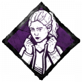
I've already bought Lara so why is she at the top? I can't buy her again.
7 -
The old UI was infinitely better than what we got with this updates UI.
- Being able to easily and clearly see what items you have selected for your preset is a must!
- Page system was convenient and made finding items easy by knowing their page number, compared to having to scroll down until finding it.
- Selecting a charm is just miserable now. Just utterly miserable.
- Save the large icons and long scroll bar menu for the store where there is value in seeing large images.
When I'm trying to select character cosmetics, I want the UI to actually be designed to make it easier and assist me rather than this unfriendly UI we got that makes it even harder.
This new UI just makes me want to only use my presets and not bother looking around for new cosmetic combinations. I wouldn't be surprised if sales went down from others doing the same.
4 -
You're right. The only way to do anything about this is vote with your wallet and prove that no, actually, shoving marketing down the userbase's throats doesn't produce results, it's just demeaning.
Also, is it just me not knowing how to navigate this mess yet or is it no longer possible to change cosmetics in the lobby? Because sometimes I liked changing to match another character (or changing to look different from them, depending.)
2 -

Like, what even is this.
If I click on any of my equipped charms now it doesn't even jump to the charm in the overview, unlike before.
And here's a fun fact, the Loadout screen is still exactly the same as it was before.4 -
They have to roll this back, it is so bad. I haven't been on my BHVR account in years but I came here just to complain about it because who thought this was a good idea? The menu was fine as it was before, this is a straight downgrade that needs to go.
6 -
Yeah this UI has a lot of issues.
5 -
The charm screen is such a downgrade. You used to be able to see twice as many charms at once. And why on earth are the sizes of the searched charms bigger than the size of your selected charms?
3 -
The way it is in the Store is perfectly fine imo. It should not have transferred to the character selection screen.
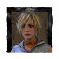
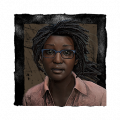
Compare the above 2 screenshots I shared. The one with Lara Croft and her charms, and Claudette with charms before the update. Both screens take up the exact same space. But because the icons are now bigger it takes more time to navigate through your inventory to find something. And having the search bar hidden underneath various layers is bad design imo.
Not to mention the removal of the Previous and Next buttons.
And it's funny that they put the scroll bar on the left, whereas it's still on the right when going through your badges and banners.All in all, L update.
1 -
The part bugging me most is having to go to characters then customizations. Instead of being on my character and clicking the cosmetics button lol
1