http://dbd.game/killswitch
Concerning the new tile

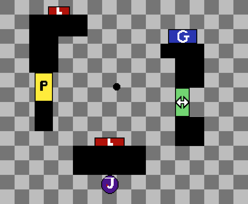
It's... absolute horrendous. I have to be that blunt, because its very clear that an attempt at something new was made, but that it only has half developed ideas strewn about and ignores many problems currently in the game. To start, here is a bad pixel art grid of an overhead view of the map, trying to match scale and distances of everything as close as possible (kept having to pause and replay video, so it is based off of the iteration witnessed and should hopefully be accurate enough to illustrate each point.)

Its rough. For a legend:
Purple circle is the hook, Red boxes are lockers, yellow box is pallet, green box is vault, blue box is the gen, black boxes and circle are the tall walls and flaming barrel. I also tried to include icons/letters relevent to the items to help with any color confusion. To start with, lets go over the problems for each side individually:
Survivor
1) The pallet. The most glaring one to most people, the pallet has absolutely nothing going for it. When this tile was witnessed, it was in the northwest corner of the map, meaning that the pallet leads absolutely nowehere. The only way it can link to any other tiles is to the north/west and the south/west, which is extremely situational. Due to the short length of the walls surrounding the pallet, there is nowhere to go. This in itself is not a terrible thing, but it is also too ineffective at even the minimum afforded by other unsafe pallets: they will generally have a "long side" that allows for mindgames concerning jumping the pallet or not. and that is not possible here. It is a pallet that is specifically for stunning and then gaining distance during the stun specifically, because there is pretty much zero instances where they will need or even want to break the pallet.
2) The lockers. The SW locker is far too close to a similar interactable, which opens the floodgates for input overlap to choose the wrong option. Admittedly I play survivor on controller, so I'm not 100% on how these types of overlaps work on keyboard, but they sure as hell affect survivors a lot, and are best avoided rather than expecting every person to go into their settings and remap their controls to lose years of muscle memory just over this change (assuming they even know to do so in the first place.) It is a situation best not instigated, so intractable should as a rule always be at least reasonably far apart due to this issue. Obviously its unavoidable when it comes to things like healing a person under a pallet, but in instances like this its just a pointless avenue for input errors.
And thats only the first one. The second locker in the top is completely useless except for one very bad application i'll get to in a moment. But the biggest issues are that it is facing almost every single avenue of approach, having line of sight even from the southwest area (due to the locker door itself being visible when opening/closing) and it is not placed in a way that even allowed for deception plays or much of anything. Its like its literally just there to get off the gen to hide your aura, or maybe sneak in to make a flashbang (or two, get it?) if the gen is deadlocked or something. The only other thing its good for is something the other one is as well, flashlight saves. Both of them can invoke flashlight saves despite being good at almost nothing else, making them extremely bad placements.
3) The hook. Short one, but the way the hook is designed it has a maximum unhook angle while having nowhere to go afterward: It is 100% dependent on the surrounding tiles to have any hope of escape, which also makes it very bad against killers returning to the hook.
4) The vault. Another of the most glaring ones, this vault might as well just be a launchpad. It serves zero purpose other than activating Lithe, and the one side is so tightly packed it is impossible to even make mindgames with. The recession is also kinda facing the wrong way for how it is applied, making it seem especially random and pointless. It also suffers from the same "where to now" problem as the pallet: you either run to the pointless pallet, or you flee the tile from near its middle (on its relevant axis) hoping for a better connecting one
Now on to the problems for the other side
Killer
1.) The walls. Having a tile with all highwalls isn't necessarily a bad thing, but their placement becomes important. When they are completely random like they are, it causes any killers with ranged abilities to have very little chances to line up their attack, especially the huntress or other killers who cant use it in extra narrow situations like the Demogorgon. It feels like Deathslinger, Trickster, Pyramid Head and Wesker make it out ok, but even the artist gets hurt pretty bad just by ironically useless the layout is for survivors: They basically end up almost all having their m1 be as effective as their power, in some cases like huntress even moreso than their power. Its always important to remember that any killer who needs to slow down to prepare their ranged power will always struggle against short tall (non)loops (like running in circles around a large rock, for example.) The placement paired with height just makes the tile revert many killers to M1 because of how anathema it is to their powers.
2.) The lockers. Pretty much already went over it in survivor, but the locker blinds being so horrendously easy on both available ones, including the one right next to the hook. That one in particular is important because of its placement, right next to the hook: This means it is prime for stun loops like Head On/Flashlight save/DS/Flashlight save/etc: all while resetting their endurance effect with any of the saves allowing them to easily use a perk like dead hard at any point to make the disengage. It makes the survivor completely immune if another person is nearby to make the save, and gives them multiple tools to break away from the forced lose/lose at any time.
3) The hook. Another repeat, but for a bit different reason: It is positioned so that saves can be gotten from maximum angles, but not accounting for the approach ones properly as well. Due to the way it is designed, it would be extremely easy to force swings to hit the person on hook instead of the unhooker, especially with a lot of the aim dressing issues in that department as it is. This positioning is not only very bad for that, one of its directions leads directly into both a pallet and locker, which means that the killer needs to make hard/fast reads on the seconds following the unhook, all while the unhooked person with BT is basically encouraged to bodyblock a hit and let the other person escape, which then promotes tunneling them out. While they admittedly have to "waste" the pallet here, since its a pallet thats only use is focused around securing the stun to gain distance that isn't much of an issue.
4) The barrel. These barrels are absolutely awful in general, but the placement of this one is strangely specific. It gets in the way of tightly looping that part of the tile, and is positioned in a way that it makes lunging around that specific corner near impossible due to aim dressing issues, almost as if thats exactly why it was placed there. It just straight up gets in the way more than any of its other obfuscation (light and sound) purposes provide impact.
5) The geometry. While obviously a second half of the walls themselves above, it gets a separate spot because of how absolutely uneven many aspects of it are. While im sure some of them may be more visual than actually catching collision wise, I also feel like a lot of them were done intentionally to try to prevent hug tech and other similar reasons: don't do that. I know that there is major outcry to remove it and that there are likely many people on the team that agree, but that is a separate issue that needs to be handled more uniformly: Testing it on random experimental tiles only makes them even worse for all killers, due to how important their collision size difference is vs survivors (especially in tight areas and around short loops, like the aforementioned slowdown during power prep.) If thats the reason, don't do it for that, and even if that isn't the reason, make them harder to snag on regardless.
Possible solutions in followup post.
Comments
-
As for solutions, my assumption is that the idea is to have a tile with all high walls, a hook/gen/2lockers/1pallet/1vault/1barrel, so I tried to use them all in better ways in my example to try to help:
As we can see, this layout attempts to fix as many of the above issues as possible: Loops now exist, but are also still nowhere near as strong as on tiles like jungle gyms: looping between the pallet and vault and delaying the pallet drop leaves tons of room for mindgames on both sides, and killers with antiloop or ranged powers have reasons and places to use them. Lockers are both functional and far less abusable, and even positioned in ways to promote deception plays while also being visible from less angles when the killer is approaching the tile. Less input overlap, the barrel's aim dressing issue is rounded down to be similar to how it is at L/T wall tiles, the vault flows into the rest of the loop (as well as disengaging from the tile) far more effectively, and every group of geometry is designed to not get killer wider collisions tripped up on minor unevenness. The hook is positioned in a way that gives it a slightly reduced 180 degree unhook window, but also positioned in a way that survivors can still quickly escape LoS from most of its unhook angles to minimize the negatives of that.
The gen is a bit of a free radical, and can be placed in quote a few different areas (including detached from any walls) but I felt like this one was the least offensive method of maintaining its positioning in the original version. In fact most of these elements are fairly variable, but this is mostly an example of how I would pair all of these elements and (what i assume to be) the ideas behind the attempt at the tile. They don't necessarily have to be symmetrical or anything like that, but everything is aligned the way it is specifically to prevent the problems with the current iteration, most importantly from both sides. As it stands it's basically a killer sided tile that also sucks for killers, so I don't think anybody's going to be particular happy with it.
If anyone else has any other examples/considerations/etc feel free to chime in as well, I'm sure there are plenty of ways this tile could be salvaged, especially since this one has a few similarities to existing tiles.
Post edited by Ryuhi on3
