Forum Feedback
Comments
-
There is way too much white space. Around 40% of my screen is actually used for the forum. The rest is the white space between the edges of the screen and the middle informational part.
The white space problem extends to the individual posts themselves. Previously, posts were divided into two sections which were clearly distinguishable by background. The header had a darker background. The body had a lighter background. The "actual" background of the board itself was the "lightest" or "grayest". This new post format makes it hard to read and is a psyop making me think there is even more white space. It literally strains my eyes to read a post, there is not enough contrast between the different sections Header/Body/Background.
0 -
I can't search for stuff using Chrome app on my phone. Anytime I try for some reason the words go in backwards. I tried typing "Why" and instead if does "search for yhW." I also can't delete letters, need to refresh the page to clear the box. I tried the Firefox app and it works fine, it's just the Chrome app.
 0
0 -
Poor customer service .. closing threads without answering or reasons.. well done
1 -
The Information Center seems to be broken now. I just get a page that says "Call to a member function getData() on null".
I was trying to access the Cube Craft characters that used to be at this url: https://forum.deadbydaylight.com/en/kb/articles/284
0 -
All URLs would have been changed due to the forum set up.
Foldable Characters - BHVR this would be the link to the foldable characters.
0 -
Thank you!
0 -
So I recently joined the MYM forums, and after that it looks like the upvotes section of my profile got reset? I have the same amount of upvotes still, but I can't view which posts/comments I made were upvoted prior to my joining the MYM forums. I kinda hope there's a solution to this because I do kinda enjoy going back and looking at how my posts were recieved.
0 -
hmm interesting one, I'll have a look in the settings and see if there's anything I can do. It would be nothing to joining MyM forums as the forum is all one BHVR forum. It might have to do with the way the rework reset things.
0 -
Something that i see around a lot and personally touches a nerve for reasons i dont really understand why is when people ask reasonably or not whether someone is new to the game or to the forum, and i know theres a thing that describes wherever you are how many posts youve made, and it would be cool if there was also a thing for how many hours you had in the game.
It would be unfortunate if it was generally unverifiable on places like mobile or xbox but it would be nice if it was something really simple like
(white badge) <10 hours playtime
(green badge) 10-25 hours playtime
(blue badge) 25-75 hours playtime
(purple badge) 75-500 hours playtime
(red badge) 500-1500 hours playtime
(black/ornate badge) 1500+ hours playtime
it would clear up confusion and you could set up a little thing with screenshots or something in the same way you ask for name changes or whatever that way people who wanted to show off game time could and people that were newer or maybe less inclined could not have a badge
and i mean people could fake it and get the best raddest badge but i mean like whatever it generally wont matter in cases other than you(or me more often) looking like an idiot and wanting to be sure that the reason im bad at knowing things about dbd is because im bad at knowing things in general and not because im new lmao
i would like this, it would make me happy, i would have a solid red badge :D
0 -
Apparently Drafts without a title to it cannot be accessed afterwards.
0 -
Even though it's more of a bug-report and less feedback I suppose this is still the best place:
It appears my notifications are bugged. No matter what I do, the unread notifications badge next to the bell icon always reappears. When I click "Mark All Read" it disappears in the dropdown but as soon as I reload / go to a different page on the forums it reappears.
The cause seems to be my own thread "Made for This [yes, yet another thread on that one]". - My best guess is that one reply got deleted by a mod before I read it: if I didn't miscount I got notified of a total of 18 replies, the thread has 19 replies, two of which are my own, so they wouldn't show up in the notifications, which means I got 18 notifications but can only read 17 comments of other people .
0 -
Whenever I switch pages in the forum currently, there's a very brief white page that appears when loading the area you're going to, e.g. if you're on the homepage and click 'General Discussions' you'll get a flash of white and then the page loads.
This really aggravates my eyes especially when I'm frequently browsing the forum at night - I don't know if there's a workaround anyone's aware of, or if it's something that can be changed, but I'd appreciate any assistance with it.
0 -
This is a temporary solution but I highly recommend you install an extension called 'Dark reader' - it's available for Firefox/Chrome and maybe others. Not only does this fix the white flash on refresh issue, it'll basically add dark mode to any other website automatically
1 -
Brilliant - thank you for this. Appreciate it.
1 -
In addition to the "flag post - report - post breaks forum rules" option, it would be great to have an option to let moderators know that a post does not break forum rules, but that it's in the wrong section of the forums (i.e. a new idea for a killer or an idea for a perk rework posted outside of the suggestions section)
0 -
Just in the past few days I've been having an error that's cropped up whenever I've tried to open a draft I'd saved since around January 25th-28th (rough estimate, I'm not sure on the exact time). The error shown is as follows:

The text reads: "Permission Problem... You don't have permission to do that."
This appears whenever I attempt to open a draft I'd saved since the specified time. I've restarted my PC, logged out and logged back in, and have cleared my cookies- nothing has altered the outcome. I just made another draft while typing this out to test if the error still occurs, and it does, so it remains an issue.
I was curious if others had this issue, if this was reversible and I'd be able to get my work back, etc.
Edit: I've also noticed the same error occurs when I click on my badges on my profile. Not sure if it's related, but being flashbanged anytime I click something arbitrary on the forums is really unpleasant, if nothing else.
1 -
0
-
There is almost always something new appearing, when one problem got fixed. It must be extremely hard to get all problems cleared but I appreciate Behavior for how much they already made to try make the game comfortable for everyone, how much work they put into this game, always with new ideas, patches, quality of life changes, with the new game modifiers… I’m very curious to find out what’s all coming in the future ☺️
Post edited by JoPhCarrillo on0 -
I don't know if this is the proper place for this but notifications seem to broken again and not showing up or at least some of them.
It used to be they would auto-read before I looked at them but I could still check once in a while manually. Now I'm not getting any. I noticed I got quoted by a user today but it didn't show up at all in my notifications.
Not sure if this was a one off thing or something else is going on.

Edit: Never mind it's working now. Guess I just had to complain about it first.
Post edited by ohheyitsbobcat on0 -
Love the forums. Is it a glitch that new comment tags on threads don’t appear as yellow anymore? They’re pitch black and very difficult to see.
Regardless, thanks for maintaining this place! 😊
0 -
When you get a notification from someone, and then ignore them before the notification has been cleared, it becomes impossible to clear the notification and you are forced to keep the red bell icon in the top corner. Even the "Mark All Read" button doesn't work - it makes the notification temporarily disappear, but once you refresh the page it comes back.
I've been going around with this red 1 in my top right corner for months now. I finally managed to clear it by going to my ignore list, un-ignoring each person, clearing the notifications, and then re-ignoring them, but it shouldn't take that much effort just to clear out a notification from someone who you do not want to be hearing from. I know it's low priority and a heck of an edge case, but please look into figuring out how to make the "Mark All Read" button affect notifications from users that are ignored.
0 -
I'm trying to give my thoughts on the new PTB and I keep getting:
CommentModel::getDiscussionThreadOffset(): Argument #1 ($commentRowOrCommentID) must be of type object|array|int, string given, called in /applications/vanilla/controllers/class.postcontroller.php on line 952
I wrote out my thoughts in detail and now it's gone.
0 -
It seems like you can't add users with Private Profiles to your ignore list, since the option is on the profile, and you can't access it due to being private. This seems like an oversight.
0 -
This is more a question - what are the down votes under reactions in profiles? Previously it was only up votes but now there's both. If I click on it to see what was down voted nothing shows up even though it says there are a bunch. Are down votes something for those visiting the forums on PC but not on mobile?
0 -
hm. I would have assumed they just got added on accident on the profiles and any numbers where from back in the days where downvotes actually existed on these forums..
but they got deactivated before i even joined iirc so.. that wouldnt be it?
1 -
Same, I joined after they removed down votes which is why I was confused when they were all of a sudden in my profile and randomly in other profiles (I looked to see if I was only one). I think I just figured it out though - when they used to have a section for Q&A questions there was option to down vote those posts if people didn't want a question asked so I think that's what it's from. Would also explain why I can't see what they go to since any Q&A section posts are gone now.
1 -
oh. Yeah that makes sense. Damn. I got so many downvotes - what did i even ask for besides accessibility stuff 🫣
1 -
From what I remember people downvoted alot of QOL questions, even if they were something neutral like accessibility.
0 -
Make it possible to one-click block harassing trolls who keep following you around the forums so we don't need to go to our profiles each time. Please and thanks. :)
1 -
The forums sometimes stutter when you go into a discussion. As far as I know, it happens on every platform and it's sometimes not avoidable.
Could we please get a fix for that? It's annoying.
4 -
This is happening for me too. It's anytime I go in to see new comments on a post.
3 -
The downvotes allow for downvote-brigading from bad actors and are a huge issue like on Reddit, they need to go. They add nothing and create bad faith.
3 -
Can we split up the feedback and suggestions section in the forum into one that is just about complaining or saying you like stuff and one that is filled with ideas for new/old perks, addons reworks and killer buffs/reworks? One that is more for creative things, buffs and new features.
It feels really bad that if you spend a long time coming up thinking about ideas and you post it, but it instantly disappears under all the complaints.
Post edited by Langweilig on2 -
That’s not even the worst part of it. There are now a lot less people actually engaging in discussions than before the change. Before they had to comment to say the dislike something and you could respond. Now they just downvote and leave the conversation.
3 -
Exactly, just like on Reddit. It's a real issue.
0 -
Can you bring back the German (Deutsch) forum section, please 🥺 ?
0 -
we do not have any German Community Managers, so we would not have this section - it would fall then under the international language section.
0 -
But you had a German section for a long time without a community manager being there until I asked to change the name to Deutsch (german world for German) after which it got removed. Wouldn’t it be possible to hire a German community manager? I think it would be nice and worth from a business standpoint. German is spoken by a lot of people and second largest language after Russian in Europe.
0 -
As of right now there's no plans to add to the team.
0 -
When will we get kaneki/ghoul as profile picture in the forums?
0 -
We are not updating the avatars further, there's no bandwidth available without removing a lot of existing ones that people are already using.
0 -
Thanks for the answer. It‘s sad to hear. I‘ve wondered for a couple of patches already why we haven‘t gotten any of the newer killers/perks…
0 -
Hey, Would it be possible for these forums to allow really small mp4 files? like less than 5MB
I want to post it as evidence or follow up on reports or to show a thing I think you need to change.
But the only way I can show it is, uploading it elsewhere on a burner account or unlisted is a hassle.I can upload them as gifs though but those take up way more MBs, depends on what you guys think is best practise tho.
0 -
Hey there,
It is obviously important to have an effective ban system to ensure constructive discussion in the forums, however I believe that the forums rules we currently have are too harsh.
There should be a de-escalation system in the forum that reduces someone’s bann level for good behavior over a longer time.
As of right now you can get 4 strike that you can easily lose by overlooking some rules. Like I’ve seen someone get banned with 11k post after years of not making any mistakes.
Additionally strikes are granted largely at the subjective discretion of the mods, regardless of intent, context or even a joke between friends.
Lastly it would be nice if someone wouldn‘t instantly get banned for small mistakes and instead first get a warning, because some of the forum rules can easily be overlooked or forgotten.
2 -

Bottom of the forums page has copyright 2023
0 -
Is there something going on with the forums? I feel like every post has these "unknown - content has been removed" comments. Are comments getting deleted all the time and now they leave this behind instead of just disappearing? Is it some sort of auto-moderation for an influx of bots/trolls? Or is it some forum bug?
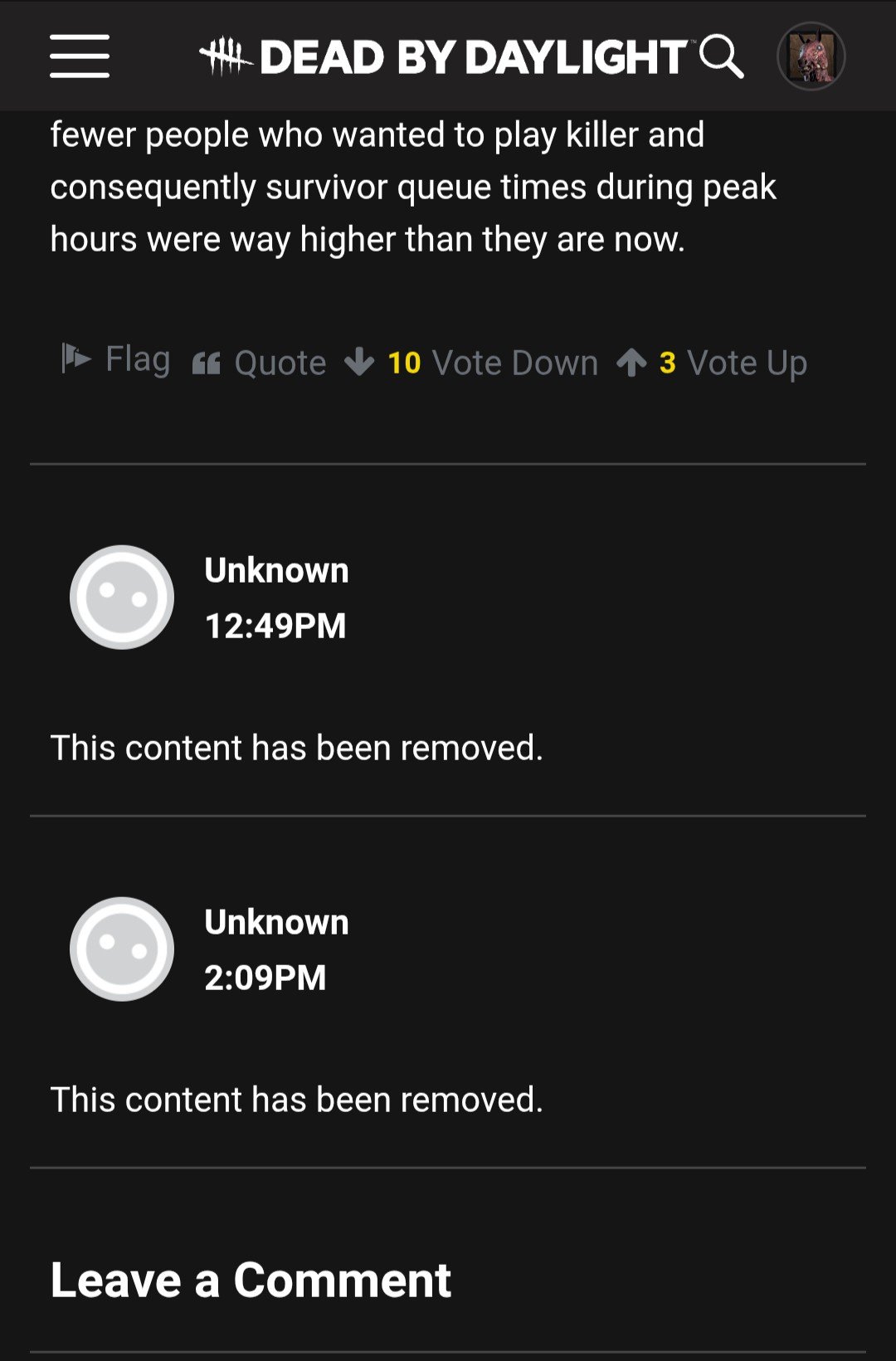 1
1 -
I think this is when someone gets a permaban
0 -
It isn't. Account deletions that request their data removed can look this way.
0 -
These are showing up on new posts fairly quick though. Are account deletions happening that frequently that these show up on nearly every post?
3 -
Is it known and/or intentional that we can't change our avatars anymore? When editing your profile, the option has disappeared entirely.
8