http://dbd.game/killswitch
The Shattered Square (The Decimated Borgo)

We'd like to know what you think about the Shattered Square map, part of the Decimated Borgo realm. Please leave any feedback you have concerning this map as a comment on this thread. Your feedback can be as brief or detailed as you'd like!
The Shattered Square (The Decimated Borgo) 269 votes
Comments
-
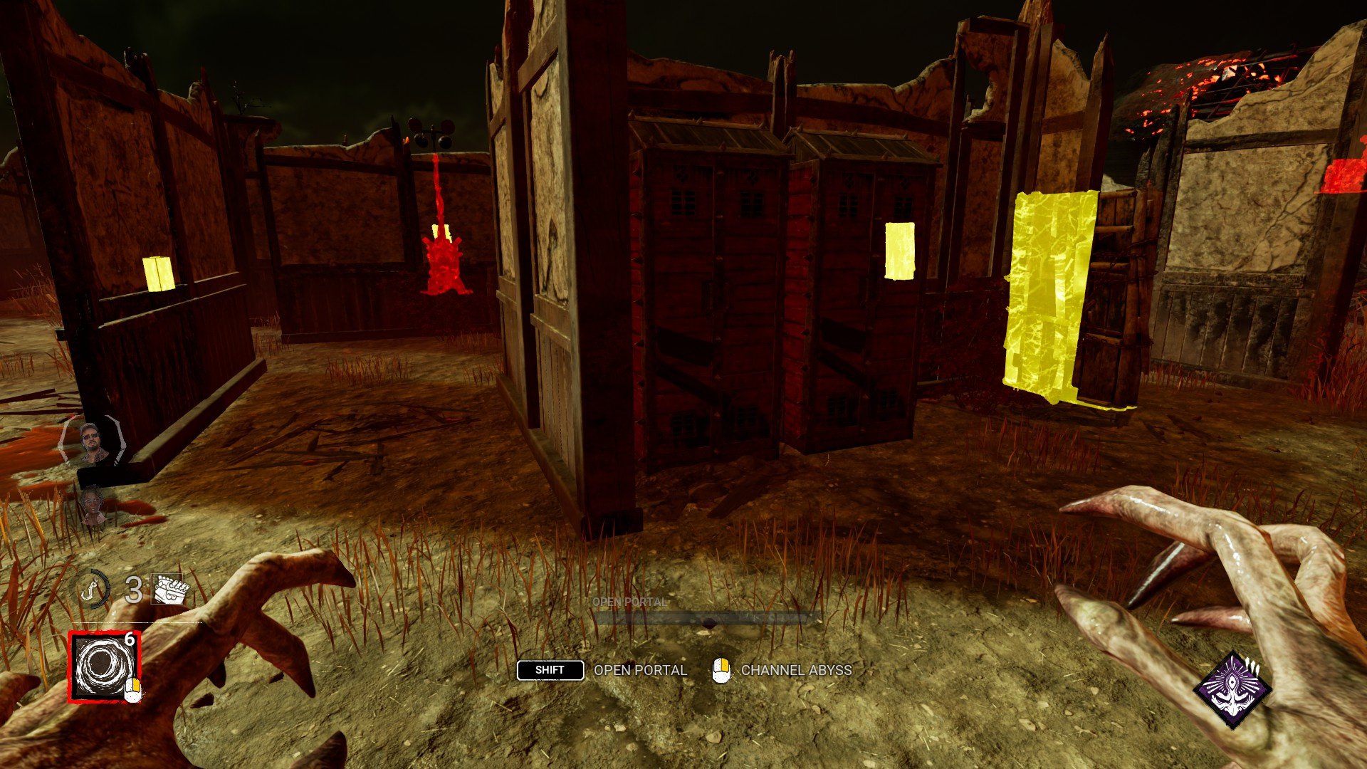
This map is so red that sometimes it's very hard to track blood pools and stratch marks.
29 -
The map is still too red. Red scratchmarks, red pools of blood, and red auras, need to be much brighter and vibrant on this map, so the red map isn't a massive killer nerf the entire game.
Alternately, give killers the ability to pre-set aura colors per map, so we aren't stuck seeing red on red.
17 -
I can't see strach marks or blood at all on this map please stop doing maps with this type of colors from the start it's a bad design for killers
8 -
Just make the map less red.
9 -
Way too red for seeing blood and scratch marks like others said. In general the red kinda hurts the eyes.
5 -
Very fair map for the most part. Feels like it's in a good place. It is too red which makes following scratch marks and blood difficult to track. Killers also refer to scratch marks that generate on the sidings of buildings/structures. So the random charred texture on some of the buildings cause me to mistake them as scratch marks from afar.
3 -
This map was awful in lights out because there's so much blood on the ground by default.
Just in general it kind of sucks because it's very similar to the old Blood Lodge where you can see what the killer's doing at all times from the other side of the map.
2 -
From a gameplay perspective, this map is decided entirely by RNG. Sometimes it's incredibly killer favored, sometimes it's incredibly survivor favored. It's weird how sometimes you'll have really strong buildings with a strong pallet or god window, and sometimes it's an empty stable. I never know what I'm going to get when I load into this map. Generally, most of the buildings are fun to play. Don't really have any complaints, other than RNG being so inconsistent.
From an aesthetics point of view, this map is awful. Too red. There are structures with burns that look exactly like scratchmarks, which is extremely annoying. Stuff like that shouldn't be part of map design.
4 -
The map is huge, weird loops and so much red. I don't know why you keep making humongous ass maps. Also, it's not fun against huntress and slinger because they can shoot over those short loops
2 -
Would it be possible to reconsider this map’s color scheme? Red is just not a good color to use since scratch marks + blood as well as several auras are red and it can sometimes make them difficult to see + the map has elements that because they are red they sometimes look like scratch marks or pools of blood, when they are not. Genuinely this map looked so much better during Lights Out when all the red color was gone. (I'm not saying make it that dark normally though.)
That said, overall balanced map.
1 -
This map is very red and hard to see scratch marks, and it's kind of a forgettable map but this map honestly is pretty balanced but favors more for killer
0 -
Very red.
Sometimes has mean 3-gens.
0 -
I don't see any explanation for voting "This map favour Survivors".
The only bad thing for killers is that the map is too red, which makes the task of tracing scratch marks and pools of blood very difficult.
Apart from that, the map has become literally awful for survivors after the rework. It spawns huge deadzones expecially in the main-building zone (which is kind of a joke itself) and most of the loops and pallets are ridicoulous.
Also, even in this case the map lacks of high-loops so good luck facing Huntress / DS / Trickster and more on...
Why are you unable to balance the reduction in mape size and its strenght at the same time?
Post edited by Gabe_Soma on6 -
Compared to how it was on its original PTB and after being updated on live servers, it feels so much better to play on, for killers at least. I'm glad it's not another pallet city. There is a lot of debris around the map that could be removed as it just clutters the map seemingly with no purpose other than to be filler. This map lacks structures to break it up more and has very few line of sight blockers otherwise. The lighting could definitely be adjusted to make it look more night time than its current ambiguous lighting.
1 -
Once again, I agree with WhoSoup. Map overall is balanced, but rng can lean it in favour for both sides.
And how it's still red, when it always was #1 complain about this map?
0 -
I didn't vote as whether killer or survivor I have a hard time seeing anything, getting stuck on seemingly just a stick, as well as feeling eye strain and a headache. This was called to your attention numerous times by many users and all you did was shrink the map which made it more cluttered. Like what has happened with all the map shrinkages. So no, I don't think it really favours anyone as even camping killers seem to get frustrated.
1 -
I don't understand why you decided to make this map red, when everything that is red usually indicates for the killer to have a further look at, which gets completely negated on this map, you oftentimes loose scratch marks close up because of the color of the map and seeing scratch marks in the distance is basically impossible, because you never know if it is just the map or actually scratch marks. This needs to be looked and maybe even removed entirely. It is just way too much of a disadvantage for killer.
The loops itself are mostly fine, but sometimes it feels like you have a pallet every 5 m, for me it was fine most of the time, but the rng maybe needs to bet looked at, because when it happened it was way too much and really obvious stuff...
1 -
I feel very passionate about my opinion on the color of this map - please for the love of all that is holy - make it more like Dead Dawg's color scheme. I am almost completely blind in my left eye, and playing on this map is a nightmare. No matter what I do to it, even with nVidia filters...I just accept a loss when I load in, because I CANNOT see scratch marks on it.
2 -
I think the layout of this map is much better than it used to be, but the colour is still way too intense. I have 20/20 vision and still have trouble seeing auras and scratchmarks, I can't imagine how rough it is on anyone with any sort of visual impairment. I do see the vision with a burning red, smoky atmosphere for a destroyed village, which I think is conceptually very cool, but the colour intensity should be distributed differently so it's easier to parse the map from gameplay elements.
2 -
Size and loops got adjusted in the right direction. Color scheme is still bad though. Would be cool to have scratchmark/aura colors adjustable as i do not think making the map monochromatic is the right direction and it does add to the atmosphere.. but still could be more natural.
0 -
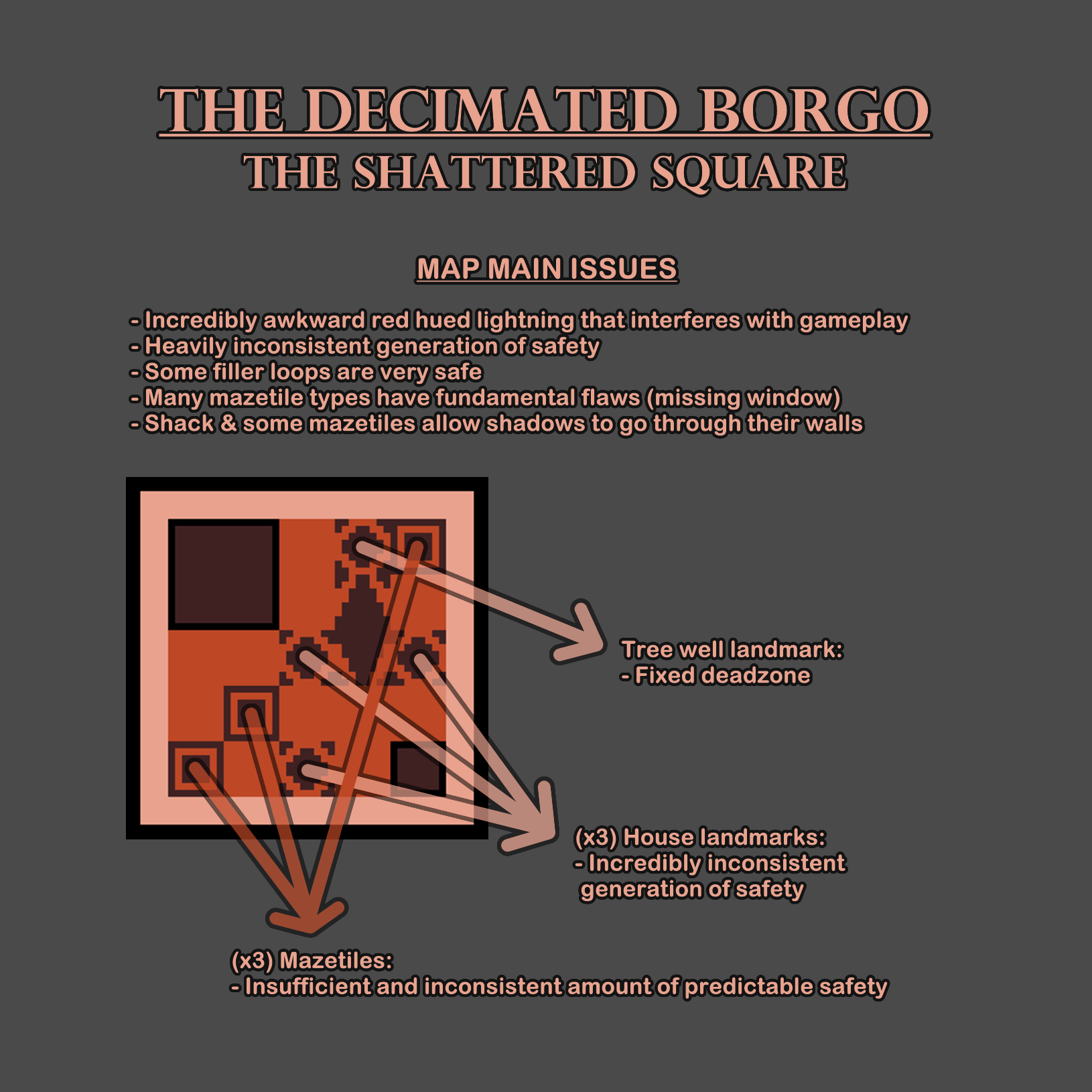
The Shattered Square is a lot better after its rework and could even be considered balanced, but that would be a vacuous title since the generation of safety is enormously inconsistent and it can favor either side. A major issue of the realm is the red hued lightning that makes all kind of gameplay elements hard to keep track of (scratchmarks, blood, auras, etc).
The pallet count differs from one trial to another, sometimes generating unpleasant deadzones. There are some very safe filler loops mixed with the semi safe ones, so not only the amount of filler pallets but also which filler loops spawned are relevant to the outcome of the trial. Main building for some reason can rarely spawns 2 pallets now, which never happened before.
The shack walls and some of the mazetiles walls allow the the shadows of the players to go through, removing mindgame potential in a very unnatural way. There are only 3 mazetiles which heavily cripple the predictable safety of the map and it is also odd given how there are 7 types in the realm and less than half will be displayed.
The tree landmark is a guaranteed deadzone despite having two instances where it could spawn a pallet, latest reason for it to be barren again was that the pallet loop was too peripheral and could be incredibly close to other loops on adjacent tiles. The long landmark (gallow or market place) seem to be spawning 1 guaranteed pallet now, tho it wasn't always like that and it may not even be hard coded and rather a conditioned coincidence (since it has the fixed deadzone of the tree near it and it covers two tiles, it may be forced by the pallet density to get that pallet).
The 3 house landmarks count with 4 types and they are absurdly inconsistent in the safety they provide. The stable is always a deadzone, the house ruins have a fixed window and may or may not get a pallet; the small house #1 gets either a pallet or a window and the small house #2 can get a pallet or be a deadzone. With all these possibilities, these 3 landmarks can go from 2 deadzones and just 1 window or 1 pallet to a total of 2 windows & 2 pallets or 1 window & 3 pallets. With these, not just the filler loops and the mazetiles but also the landmarks are inconsistent.

One of the mazetile types, commonly known as "variant gym" or "unique gym" is missing its window on both variations in The Shattered Square. This is not an isolated case, since it started as a bug in Yamaoka Estate and served as base for its design in Eyrie of Crows, Garden of Joy and The Shattered Square. The bug got fixed in all other realms except for one instance (of two) in Garden of Joy, yet it remains in The Shattered Square affecting both versions of the tile (it usually was only on one). This mazetile was originally designed to have a pallet and a window, not only it is not fun for it to be missing the windows but it also taints the essence of mazetiles being beacons of predictable safety for survivors and tiles that can be mindgamed for killer.

There is another mazetile that is missing the window on one of its variations, the "impostor gym" (mazetile that mimics other mazetiles, usually a jungle gym, while adding key changes that affect the gameplay), and it is a shame given that its counterpart in the shack side of Garden of Joy had a better design and it got removed recently. It could take upon the mantle of its pioneer and have a window on the outer gap at the left side.

The Shattered Square needs to follow several changes to become more consistent and appealing: making the lightning of the map less intrusive for gameplay, adding the missing windows to the mazetiles that should have them, fixing the shadow issue with some walls like shack's, adding consistency to the house landmarks, weaking the stronger filler loops while increasing the pallet density to compensate.
The layout could be tweaked slightly to fit a 4th mazetile (solidifying the consistent predictable safety) and if necessary, main building could be relocated away from the corner, given that in the old version of the map it was never an issue for it to be adjacent to other structures (since the building is not particularly strong nor large so there wouldnt be any powerful set ups involving it).
4 -
Mostly fine, there's some double pallet set ups that haven't been fixed, and the red color makes tracking very difficult.
0 -
The map is terrible to play on as survivor since the rework!
The main building is in the corner, which makes it useless and it isn‘t even strong.
Almost the whole map is a deadzone and the pallets and loops are on so weird places that you don‘t even find them.
Clearly here are only killers commenting, because no one mentioned how bad it is and I really liked it before. Now as killer I think easy no challenge and as survivor dead, which makes it no fun on both sides for me.
2 -
map is fine. Its just the red, it strains my eyes and its hard to find blood and scratch marks.
0 -
It's like they looked at Eyrie Of Crows and Haddonfield and thought "okay, so we don't want a massive building here, but let's use all the tile styles from those maps here too."
The areas that have a pallet and vault near to them but is essentially like an edge wall in the middle of the map is nuts. Survivors can get two full rotations of this before actually needing to go to a proper tile to drop a pallet to remove bloodlust. I don't understand the fascination with making tiles with no mind game potential that the Killer can only follow at is. Awful design makes gameplay on this map so boring. Eyrie has this with a graveyard, Haddonfield has this with cars backed into eachother. Stop making these tiles. The chase gameplay suffers so heavily from it.
0 -
No one likes the colour scheme of this map, it's an eyesore and scratch marks, blood and auras blend too much.
0 -
the map itself is good but the color scheme makes it impossible to track auras, scratchmarks, blood etc.
0 -
It’s funny how all those killers here still say it‘s survivor sided and too difficult for them (you see most people in this forum only play killer). This map is so terrible to play on as survivor. I would just dc everytime, when I wouldn‘t get a timeout.
Almost everything is a deadzone, bad main building misplaced in the corner so that the last potential it had is gone, two jungle gyms WOW and mostly 50/50 pallets aka free hit pallets.
4 -
This entire 'Mapping the Realm' is a joke.
People give ratings and feedback completely opposite to the objective reality of things just to throw the developers off track.
There are maps with a very high kill rate, yet according to this forum they are balanced or even surv sided (because maybe they have one god pallet that bothers them).
4 -
The map suffers from pop in that might exist on other maps, but that is only noticable here because of how open it is. It makes it hard to know where you are on the map and difficult tp find the exit gates.
0 -
Yes, they can‘t really take any of this seriously. I‘m also mostly voting for killer sided besides some like badham, because otherwise there is no one saying we don‘t need all maps to be like borgo.
They should finally return back to their past map design. It was far better gameplay wise and atmosphere wise.
I just don‘t like that every map becomes a huge deadzone with only pallets that guarantee hits. Looping one of the coolest part also gets more and more terrible with each update.
1 -
I feel like the map is balanced overall but the RNG can flip the turn sometimes for both sides. It would be better if the map is more reliable with loops and structures. This would also help newer players. One reason why so many players run Windows of opportunity is because of maps like this with random rng and this random rng is just bad.
Also this map is way too red and its very hard to see blood and scratchmarks on it. This is the main reason why I don't like this map and because it hurts my eyes so much. I don't understand why you did not change it all this time eben though so many players complain about it and it is a huge accessibility issue.
0 -
I'm probably the only one who likes the red of this realm. MacMillan is blue, Autohaven is green, Coldwind is yellow, Borgo is red. That said it's probably an issue because of blood and scratch marks. However I'm only the minority don't listen to me
Anyways, pretty balanced map and overall decent gameplay for both sides.
0 -
The red saturation interferes with regular gameplay and makes red stains and scratch marks extremely difficult to track. Furthermore, there are regular deadzones that spawn around main which make no sense since main structure is significantly weak and cannot be chained into any other tile. The safety rating is poor for survivors, especially since there is no high wall structures to provide protection against ranged killers. All filler loops feature low walls which are easy for ranged killers to hit over. Please add high walls in fillers and remove the red saturation like it was during the Lights Out modifier.
0 -
Make it less red please
0 -
It's awful for Ghostface :(
0 -
Its okay now but still too much hard to read marks and blood from Survivors sometimes. Make it less red please.
0 -
Hard agree, let Killers create pre-sets for Aura/Scratch Mark colors so they can swap per map. For me this is an issue on Borgo and Ormond more than any other map, and I can't see scratch marks no matter what color-blind setting I use.
0 -
Design-wise, the map is great. Gameplay-wise not so much. The redness is still a problem for seeing scratchmarks properly. Also it can spawn those "Imposter Gyms" which miss a window, making the loops very unsafe when you expecting something different. This seems to be a bug though as the same issue was resolved for other maps.
0 -
Map is very red and I wish that a different color scheme could be used.
0 -
Never make a red map ever again.
1 -
Why is it red?
1 -
My only gripes are it's a bit too red and HOLY CLUTTER! I cant tell you how many time I thought I was running to a loop but it was just boxes and disappointment.
1 -
The red. The red is the worst. It needs to go. It doesnt make it feel like a medieval battlefield. So hard on the eyes and so hard to see anything since alot of things like auras, scratch marks, and red stains are all red. General balance wise, its okay. no real issue but I liked it when you had a lot of unsafe pallets and little safe ones. Promotes skilled gameplay.
0 -
Same thing that everyone else is saying, the map's lighting with the red makes it just really hard on the eyes and very difficult to see basic things like auras and scratch marks. The map is also a tad bit too big and has a lot of pallets, but the pallets are kinda strange and usually weak/can't really be mindgamed. Overall just not a good time imo
0 -
The colour palette is awful. It should be tuned from red. Other than that idc much.
0 -
I think the map is more balanced for both sides than in the past, except that the generation sometimes generates two one-way boards in the main building or multiple jungle gyms connected to each other.
However, the red design that visually attacks the eyes of killer players needs to be changed. Even if it is just a scratchy map, it is getting more and more difficult to grasp with this color.
0 -
People in this thread are saying this map can vary a lot depending on RNG and, like. Yes. This is an RNG based game. That's normal and fine that the random tiles can end up favoring one side or the other. The layout is the map is fine imo and feels a lot more fun since it was changed up a while ago. But as others have said, the color scheme still feels rough. I do think it looks really cool, so it's a shame to have to change it, but the amount of red in the color scheme really hurts visibility.
0 -
It's kinda rng but it's mostly balanced. But my god this map needs A LOT less red.
0