http://dbd.game/killswitch
Accessibility Issues with New Quest and Rift Page
Maybe someone who spends more time working on UI/UX can explain what's happening here but I'm having a lot of difficulty "reading" both the Quests page and the new Rift page.
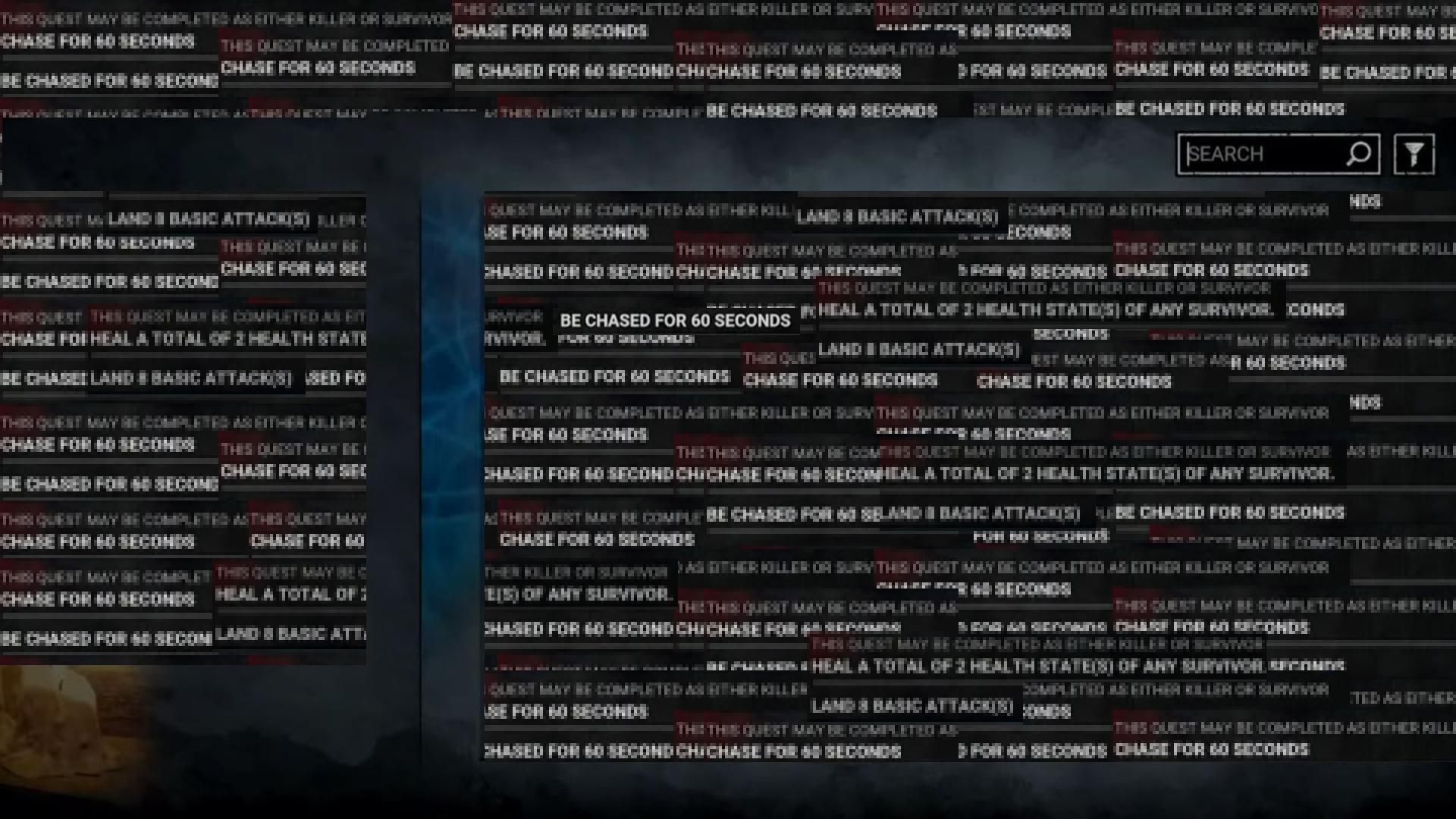
With the quest page, I don't know if it's because all the fonts are the same size AND in all caps (even the side bar) but my eyes can't figure out where to look, or even where to physically focus (re: do I look at the white bold text or the killer/survivor icon? They're both pure white and "bold".). This is making it extremely difficult for me to read what the challenge actually is, strains my eyes to the point where I can't even understand the word I'm trying to look at. I end up having to close the page and walk away from the game for a few minutes until I can "see" again, before I can queue back up.
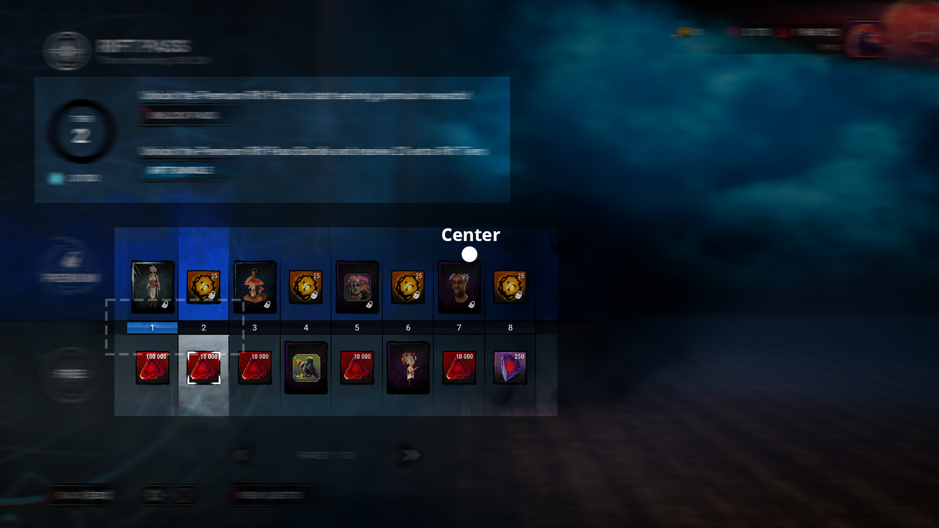
On the Rift page, I'm trying to look ONLY at the blue progress bar and number itself but if I want to look at the reward icons, I'm now struggling with all the information on the page like I do with the Quest page. It's like there's two distinct areas on the rift page and my eyes are trying to look at both of them at the same time. Maybe it's because with the Rift page, the place I'm "supposed" to be looking at isn't the center of my screen anymore? I can't even "read" the text above the bundle buttons--like the letters are just shapes and not actual words to me.
There are two other times I have this issue:
(1) I'm driving when it's lightly raining--my eyes will have an issue trying not to focus on the rain drops on my windshield versus what's outside the car.
(2) The new Samsung OneUI battery icon where the text is on top of the battery icon when the drain "line" is behind the battery text.
I'm including images that kinda explain what I'm "seeing" when I look at these pages.
the tl;dr everything is the same "size" and is fighting for spacial hierarchy and it's hurting my eyes.

