http://dbd.game/killswitch
The Claudette Skin: Design Compromised
Comments
-
So that's not what OP is complaining about.
4 -
It's not completely different. There's only a few changes. It's still the same skin despite the tiny changes.
0 -
Lots of quotations but very little counter arguments. The contest itself says the art is an inspiration for the skin. Inspiration =/= Exact copy. Id read more carefully before you tag 3 people in one post.
0 -
Then why make exact copies of the last two winners?
4 -
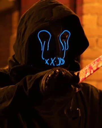
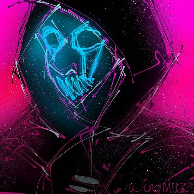
We have to wait a little, for my Legion, the renderings are quite minimalist, we do not see all the details and the final quality,
But I still saw some interesting changes, they are no longer the same mittens, they are different but very classy! These are cables that keep the spray on his chest, it's a better idea than what I had proposed. I'm waiting for a better quality version to give me an opinion, I'm just afraid of changing the scarf by a kufiya (it's the correct terms ?),
I found that it gave an imposing and badass side with the thickness that covered part of the mask. There is also no effect of the end of the scarf which floats at the back of the back, I would like to see tears on certain places of the hood just to have a different hood design for him ( it would also make it darker). Apart from that, making the mask simpler may also be interesting in terms of design, I can't wait to see the result.
PS : Please don't insult Nohequin's design, she just entered the contest and her concept is very interesting and new to Claudette, it's just a matter of taste, she doesn't deserve so much hate.
Sorry for my English if some sentences are difficult to understand.
0 -
So boring thread, arguing on cosmetics wow
0 -
I Just think, in terms of the Claudette skin, that people were upset it won because of its simplicity. When the devs said they were looking for originality, most people didn't expect a skin in a tank top and sweatpants would win ya know.
1 -
I can understand, I believe the negative comments also played a role in Claudette's changes.
A lot of people wished they had Yui but I think his skin was pretty similar in style to what Yui wears in general. Freestyle Claudette offers a fairly new concept that fits Claudette well. That's why I don't understand all the hate around this.
0 -
The shoes and the pants are the only thing that look like ass imo.
This outfit just looks like one of Megs sweatpants outfits. You can see the ankles, she's wearing jogger sweatpants now instead of Harems. (Joggers are tacky and unstylish as hell btw) And her shoes......WHAT ARE THOOOOOOOOOOOOOOOOOOOSE!!!!!
1 -
Honestly I really like Legion well there are some points I wish could be improved it's not that bad I just wish they keep the expression changing mask that was the mean selling point of that cosmetic anyway.
The actual body is alright I wish her scarf covered more of his neck but I guess they wanted the Frank tattoo to show.
Hope the weapon looks amazing because outside of Joey's karambits, the lunar New Year knife and the jagged obsidian blade the Legion weapons are kind of just meh or bad
The rulers look horrible
The default blade is boring
The smooth obsidian blade is nothing special
The Robbie the rabbit blades are just dull
1 -
They took the all of the color out of the Jacket
They made the hair look so bad they didn't even keep the beanie
They pants are super boring and they removed the thong which was like the only good part of the pants
Man they really ruined this one for me
1 -
That skin should have never been for Claudette in the first place. It's completely against her character. I think the devs version looks better.
1 -
Honestly I was expecting it to be really bad. DBD does not have a good track record with sweatpants (see my girl Meg and her ugly alt default grey sweatpants).
The hair on the skin looks less "full" than the art, the color of it is red instead of magenta, also I think she really needs abs. No joke. This skin needs abs. Otherwise it looks weird. Also the sweatpants don't pool at the ankle which kinda ruins the vibe it was going for.
0/10 would not buy. At all.
0 -
Like I know this isn't your point but, one question I ask myself is, what's so wrong with a thong to the devs yet hag's allowed to have titty out on her base skin? It's a weird choice imo. Titty I'd say is FAR worse than thong.
Like that's the only reason I could think to remove the thong, moral panic. And yet, the hag titty is allowed to stay. They have freaking jiggle physics on boobs, and yet a thong is apparently wrong to them. I am baffled.
(BTW it's perfectly fine that you don't like the thong, everyone likes different things, I'm not questioning you, but the dev's choices)
0 -
The concept Is a 8/10 for me.
The preview is 4/10
2 -
Because hag is already an extremely erotic character. You could put her in a french maid outfit and I guarantee she wouldn't be any sexier than she is already (btw devs if you make that a cosmetic I'd like some credit)
0 -
Not like anyone from BHVR cares, though.
I had contact through e-mail and the conversation stopped as soon as I mentioned this thread.
Player feedback will be ignored.
0 -
It seemed, tacky to me, i get hags titty (by the way your post made me lol) she is in rags, all stick n bones, but yes i mean jiggle physics etc i understand, but even though i didn't care for it would ratherof it been in and made with the design as the artist did. Is very much wondering if vagazal, nipple piercings and corsets are soon to come out! lol
0 -
The Legion outfit looks a tiny bit like the Druid from Slasher.
0 -
Picture or it doesn't exist.
0 -
0
-
0


