http://dbd.game/killswitch
What about this UI Design?

NOTE: I AM NOT THE CREATOR OF THIS. THE ORIGINAL THREAD IS FOUND HERE: https://www.reddit.com/r/deadbydaylight/comments/ktadcm/going_off_of_some_of_you_guys_and_previous_design/?utm_source=share&utm_medium=ios_app&utm_name=iossmf
Just about everyone hates the UI design. The devs want something that helps new players, something not so simplisitc with vague character images, blah, blah, blah. Admirable as that is, they ######### up something very simple, this is not big or new news.
So suppose some Redditor can come up with something better?

It meets the devs current requirements ¯\_(ツ)_/¯.
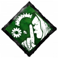
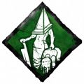
- Distinct character icons. (no more extra informative than the new dev version)
- It's the same size as the live one so it's not smaller or more awkward.
- It displays the current status without sacrificing the character portrait. (Even better)
- Hook Progress is shown as the devs wanted and looks cleaner.
- All of this is still in one convenient location.
The biggest downsides I can think of that fail to meet the dev's current desires
- Character Portraits are not colored or whatever the deal there is.
- "X gens remaining" text does not appear. (Easy fix. Put directly between the Gen icon and the divider.)
- Blood splash is smaller and likely less noticeable. (Easy fix, use current live version.)
Given how easy it was for someone on Reddit to condense and easily create a superior alternative...ᵏᶦⁿᵈᵃ ᵐᵃᵏᵉˢ ᵗʰᵉ ᵁᴵ ᵈᵉᵛᵉˡᵒᵖᵉʳˢ ˡᵒᵒᵏ ᵃ ᵇᶦᵗ ˢʰᵃᵐᵉᶠᵘˡ
In any case what do you think of this alternative design?
P.S.: If you happen to stumble across the original creator, give them props and please link their thread in her, that'd be greatly appreciated.
Comments
-
Yeah. A lot of things would be better than what they are going with, but it isn't like they'll consider alternatives.
0 -
I love this design, dont get me wrong, but I think their trying to go for a more immersed experience with the game and the quite silhouettes dont make the cut
0 -
I’d love this as the new Hud
...anything on and near the bottom of the screen is preferable
the devs seem quite fanatical and adamant about their design, and there’s a feeling as though they aren’t willing to listen to alternatives regarding the hud.
They did say that new additions were on the way in the near future, and that their new design provided excess space to accommodate these features.
Their new hud design is spaced waay far apart, and in unorthodox locations all around the screen.
I personally don’t want many new additions creating a solid border around my screen like I’m monitoring gauges while flying some kind of aircraft.
6 -
I personally love thing. Thanks for sharing.
5 -
I'd love just for these icons to be on the new hud.
4 -
Old UI:
Healthy: flat art
Injured: flat art
Dying: flat art
Hooked: flat art
Dead: flat art
Scarified: flat art
New UI:
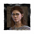
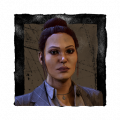
Healthy: 3D protrait
Injured: 3D protrait with red glow
Dying: flat art
Hooked: flat art
Dead: flat art
Scarified: flat art
What it should be:
Healthy: Flat art Dwight portrait
Injured: Flat art Dwight portrait with blood splash
Dying: Flat art Dwight dying
Hooked: Flat art Dwight get hooked
Dead: Flat art Dwight skull
Scarified: Flat art Dwight skull
Go the same with all other characters.
2 -
Completely agree.
Though maybe the unique skulls would be a bit much, as they'd already have to make a lot of new flat art icons for all the characters and their health states.
4 -
Yeah idfk. It's weird considering that, ironically, there's more space for further features if everything is condensed. More info and not spaced apart like some Microsoft Spreedsheets project, while keeping most of the remaining screen clear of clutter for more cluster-crap.
2 -
Being truthful my immersion is completely killed with the new UI because it looks like a mix of a game trying to replicate E-Sports off of Mobile.
3 -
Thank you very much
0 -
Anything is better than what they suggested tbh cause this isn't a mobile game, but this is preety good.
Gens remaining text should be optional, I can see them leaving it on default for new players but the rest of us don't need or want it it's just extra clutter blocking our vision
2 -
how is an ugly coloured jpeg of quinton's face immersive?
Silhouettes are way better.
2 -
I like this UI a lot more than the one that came out in the PTB because it is all in one place so that you can quickly look but you also get the new information which is what the devs want to add.
1 -
I love the way this looks! Props to whoever created this.
0