About the UI
Much better than before and doesn't strain my eyes as much as it did previously. Only issue I have is the scoring indicator being on top right. Maybe center it to the right? Otherwise the UI is decent
Comments
-
I'd move scoring indicator back to it's original position as well.
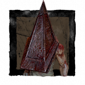
Also I don't understand why items/killer power + addons are so big. Bigger than gen indicator and survivor icons. I know which killer and which addons I brought, why does it have to be so big?
7 -
That's true actually. Even though the addons are big, I still won't know what they would do if I look at another streamer or a content creator playing the game. It's completely pointless to keep them bigger than the actual objectives and the hook counter
0 -
I think it is too big and clustered now. I don't know how people prefer this but I will get used to it.
1 -
Did it release with a scaling feature?
0 -
It was semi fine change. But yeah, I still don't get why there isn't adept achievement icons (which isn't issue here now, but...)
...why icons aren't positioned horizontally? You'd do that, you can re-position event scores back to where they used to be?
Other than that, it looks decent.
and BHVR, I haven't been playing your game in for what? 1 month? I was seriously protesting, not just talking crap.
I can give this a chance, but my negative feedback on Steam STAYS.
2 -
because you aren't scanning that area. You aren't actively looking for anything in the distance at ankle level. Grass and walls often block anything at that height either way. There is also no killer that could fit within that area, and anything in front of you that you wouldnt want to step on (various traps), will already be in your central vision if you can see it.
The upper parts of your screen are where you see killers/survs, gens and totems, vaults and chests. Nothing you are actively looking for will never be sitting at the bottom of your screen
2 -
because cameras are often angled in a way to maintain the most useful information on your screen at a given time, which puts information in front of you, not under your nose
2 -
https://i.ytimg.com/vi/zasEuhjlRqU/maxresdefault.jpg
I typed in "dbd gameplay". This is a random, but solid, example. Most people naturally angle their cameras this way. Notice how the hooked person is physically higher on the screen? This angle provides your entire screen with information. The top and center of your screen shows what is ahead of you more effectively because dbd isnt a first person perspective as a survivor. Your eyes are effectively above your head, so this angle provides far more information. If survs played in first person then you would be right, there would be no great reason to be looking up other than to find gen lights. But due to this perspective, the top part of your screen is often showing you important information about where people and things are
1 -
We're just gonna have to disagree on this one. I've been playing since release and this is just standard with higher ranked survs. Keeping as much info on your screen at a time is really important, and this gives you info on things at a distance. You can see killers from a distance, gens, everything. This just kinda is the standard.
2 -
thompson's is so unusually high, and def an exception to normal dbd. In most situations, this angle puts the most information on your screen. There is a line where there is no more useful information, but angling your camera in specific ways keeps all of the relevant info on screen at once. Camera manipulation has always been a big deal to getting info and I just dont think the devs understand these facets of the game enough to make effective changes
2


