We know players encountered different issues when playing the Black Banquet Event, and we wouldn't want you to leave the feast still hungry. We'll be providing 5M Bloodpoints to all players, redeemable in your in-game inbox. Thank you for your patience as we worked on these issues, and we hope to see you in The Fog!
Loadout visual update feedback
There's a couple points I think are worth mentioning from today's update to the loadout UI (or previous issues) that I think could use some further improvement.
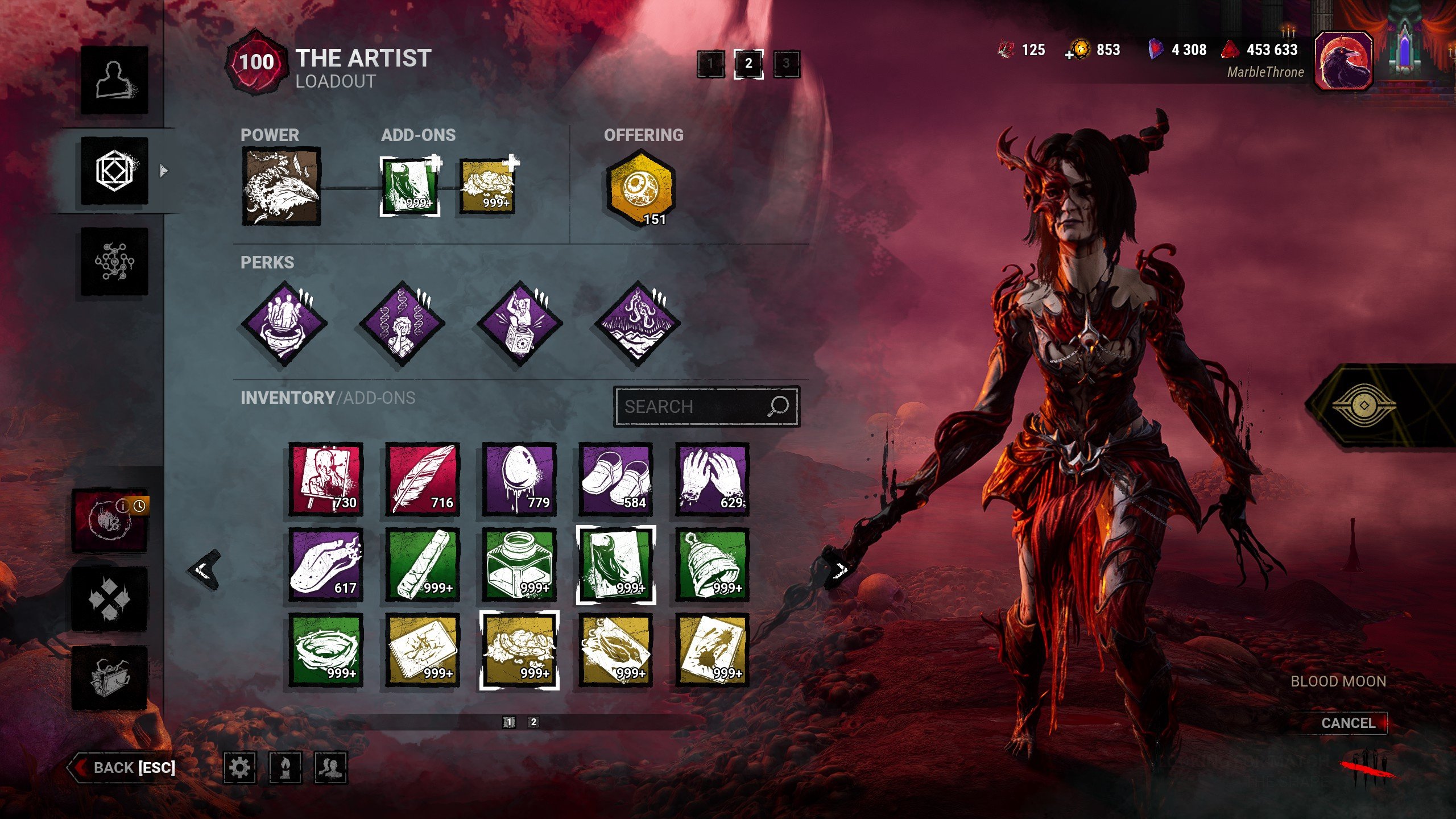
- With this change the number for the amount for addons/items got pushed more towards the center of the icon. I think it now needs to stand out more, with some of the addons and items it can be very hard to read because the white text overlaps with the icon. This problem is also present with some offerings, but a bit less due to the shape of the offering icon.
Something as little as giving the text a bit more outline would already help a lot.

- Capping the display for addons/items at 999+ just doesn't feel necessary. If reverting or increasing the cap of this display is not possible, it would be nice to have a way to find the exact amount you have.
- I like that addons you don't have (or ran out of) now display in the inventory, I do think they should be displayed in their normal position instead of at the very end, for consistency sake but also so that it's properly grouped by rarity.
I really like the rest of the changes, mainly the search bar feels like a massive improvement and I also like that I'm now able to tell when I'm almost running out of the addon/offering I use without having to check in my loadout each time.
Comments
-
Thank you for that super constructive feedback as well as the visual representation to enforce your point, that really helps for when we discuss with the relevant teams what the issue is <3
6 -
I very much agree with all points made!
While it is 100% a 'first world problem', having your collection of add-ons, and maybe even items and offerings, shown as 999+ with no way of knowing the exact amount is a bit sad. Surely there is a way to revert that back to what it was, while keeping the current UI update intact :)?
Thanks in advance for your consideration.2 -
Agree with this. Simply showing "999+" removes part of the enjoyment of saving up that many addons in the first place if there's no way for the player to actually track anything beyond that number.
1 -
Leave the cap, but make it 666
1 -
I have a question: Since you updated the loadout (it looks good) is it possible to change the HUD a little bit more? A few patches ago, you changed the survivor and killer HUD in the menu to it's current one because there are future changes that cannot be implemented in the old one. What I really dislike is when I'm in the Loadout menu, I have to switch to the Characters menu and then switch to Custimization when I want to change the outfit. It is also kinda annoying when I want to check which of my survivor has a cake because I have to switch from character to loadout and then back to character and then back loadout. It feels so clunky and annoying. Are there any plans to make it a little bit smoother or easier?
0 -
What platform is that on, and are you using any sort of custom icons there (can see t3 perks green)? the border looks a lot thicker than in other screenshots is why I ask
2 -
How do you guys have so many addons? Do you not spread out your leveling?
0 -
Love the new UI for all of this :D
-1 -
In my case, I did get everyone on both sides to at least P3, and licensed characters to P6 for the bloody outfits. But I don't really play most of the characters from the Survivor or Killer roster outside of dailies or tome challenges and so I don't consider it necessary to prestige them any further. I have my 3 mains, a few side-characters, and that's where all my points go. This Blood Moon I will be spending everything on said mains, even if they're already at P100.
0 -
yeah looking at you screenshot I was concerned about the borders as they're a lot thicker than they should be, but that's down to the custom icon pack.
0 -
The old UI used to look so much cleaner. The thick chunky borders around the icons look bad and makes everything look cramped. Also ironically adding an outline around the number text actually makes the numbers a lot less legible. It's very hard to see the numbers now, not very accessible for anyone with vision issues.
Here's a side by side comparison. Top is the new design, bottom is old.
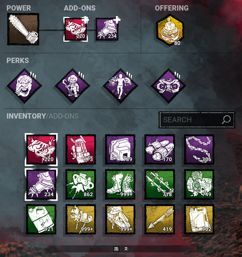
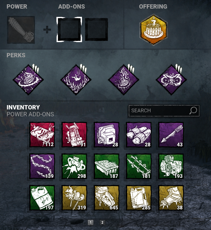 2
2 -
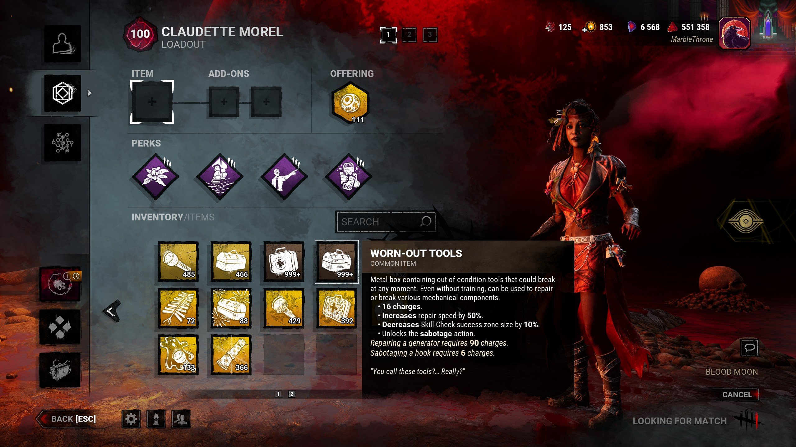
At the very least you should be able to see the full amount of an item, add-on or offering in this pop-up window. "Worn-Out Tools x 2500" or something. Or just a number displayed in the top right or bottom right corner.
1 -
Please fix this it’s hurting collecters
0 -
I'm doing a lot of challenges with my community where we collect items/add-ons/offerings and this change completely killed it. Please please please revert this change. I've played this game for over 9k hours and I want to show and know how much I earned in that time. Where's the point in grinding if I don't know how much I've gotten?
PLEASE REVERT THIS CHANGE!
0