Visit the Kill Switch Master List for more information on this and other current known issues: https://forums.bhvr.com/dead-by-daylight/kb/articles/299-kill-switch-master-list
Update some graphics (small things)
I know there are other more important things in the game that require addressing, such as new content and bugs in general but I, myself like to pay my attention on small details and eye candy of games. I am not a art designer or anything professional like that. There are just some things that have been really bothering me at least personally. These are supposed to be some constructive criticism towards the artists and modelers of the game. Not sure whether they're such big things in others users eyes but I can give few good examples:
Prestige textures: For instance, on Meg, the prestige blood looks fantastic. It's dried on the clothes and skin in realistic way and shines just nicely. It looks like you would expect someone covered in blood to look like, but unfortunately, there are some embarrassing inconsistencies with certain survivors and killers. It kind of looks like red paint, like some 5-year-old just opened up microsoft paint and thought blood looks red so they pick default red color from the palette and just smear that across the texture sheet. Maybe really fresh blood straight from arteries might look as bright red but in my opinion, it just doesn't fit on the characters.
Art style: Another similar (small) issue I've noticed is that the overall art style of the game doesn't seem so consistent. I am not an old player, I got into it quite recently, but it seems that the old maps and old characters seem more painty and artistic in a way, if that's how I shall put it. Most of the new stuff is super detailed such as Jane's jeans, they have so much detail but compare them to some of the original characters clothes, such as the Nea's green shirt. Probably a good thing that the artists like to make things more detailed but it just looks little inconsistent with the original art style. It's barely a noticeable thing though.
Models: For most newer characters, there seems to be lots of model issues. I don't mean this in such rude way but... like, for example Jane and Ashley seem kinda rushed, if I am just straight forward. I am not a model maker but there's just some weird stuff going on with them sometimes, like I don't even know where to start. For example, for Jane, when she stretches her arms or legs into some directions, the bends seem to kind of squeeze or stretch in weird ways, and if you combine the red dress top with blue jeans cosmetics while she's on the hook, struggling, you can see inside of her. Also Jane's striped shirt has these shadows textured underneath the armpits, which do look alright most of the time but not exactly whenever she rises her arms up. Also it would be really cute if Ashley's doll would actually hold items with the mouth instead of clipping the head through everything.
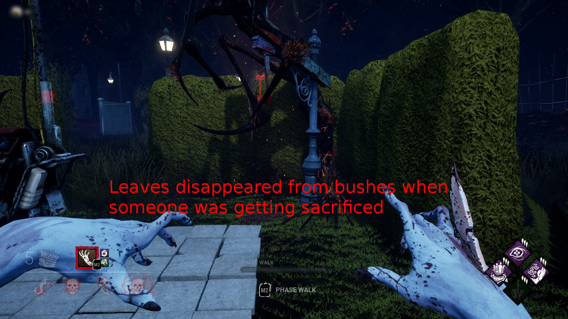
I will attach few additional screenshots and other small details that I didn't mention, with descriptions.
Comments
-
Yeah I've been thinking about this for a while. Id like to see some expressions on their faces when they're hooked.
1


